Buy New
-
To see product details, add this item to your cart.
Ships from: Amazon.com Sold by: Amazon.com
Used - Like New
-
To see product details, add this item to your cart.
FREE Returns
Return this item for free
We offer easy, convenient returns with at least one free return option: no shipping charges. All returns must comply with our returns policy.
Learn more about free returns. How to return the item? - Go to your orders and start the return
- Select your preferred free shipping option
- Drop off and leave!
Ships from: Amazon Sold by: Amazon Resale
Return this item for free
We offer easy, convenient returns with at least one free return option: no shipping charges. All returns must comply with our returns policy.
Learn more about free returns.- Go to your orders and start the return
- Select your preferred free shipping option
- Drop off and leave!
Download the free Kindle app and start reading Kindle books instantly on your smartphone, tablet, or computer - no Kindle device required.
Read instantly on your browser with Kindle for Web.
Using your mobile phone camera - scan the code below and download the Kindle app.
Follow the author
OK
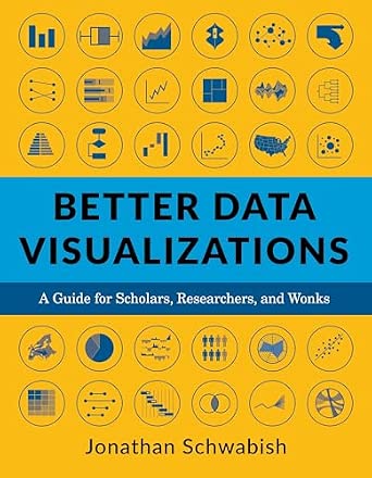
Better Data Visualizations: A Guide for Scholars, Researchers, and Wonks
Purchase options and add-ons
This book details essential strategies to create more effective data visualizations. Jonathan Schwabish walks readers through the steps of creating better graphs and how to move beyond simple line, bar, and pie charts. Through more than five hundred examples, he demonstrates the do’s and don’ts of data visualization, the principles of visual perception, and how to make subjective style decisions around a chart’s design. Schwabish surveys more than eighty visualization types, from histograms to horizon charts, ridgeline plots to choropleth maps, and explains how each has its place in the visual toolkit. It might seem intimidating, but everyone can learn how to create compelling, effective data visualizations. This book will guide you as you define your audience and goals, choose the graph that best fits for your data, and clearly communicate your message.
- ISBN-100231193114
- ISBN-13978-0231193115
- PublisherColumbia University Press
- Publication dateFebruary 9, 2021
- LanguageEnglish
- Dimensions7 x 1.2 x 8.9 inches
- Print length464 pages
Discover the latest buzz-worthy books, from mysteries and romance to humor and nonfiction. Explore more
Frequently bought together
Customers who viewed this item also viewed
- Storytelling with Data: A Data Visualization Guide for Business ProfessionalsPaperbackFREE Shipping on orders over $35 shipped by AmazonGet it as soon as Sunday, Sep 20
- Storytelling with Data: Before and After - Practical Makeovers for Powerful Data StoriesPaperbackFREE Shipping on orders over $35 shipped by AmazonGet it as soon as Sunday, Sep 20
- The Big Book of Dashboards: Visualizing Your Data Using Real-World Business ScenariosPaperbackGet it as soon as Monday, Sep 28
- Storytelling Charts: Visualize Vertical Logic in PowerPoint: A Step-by-Step Guide and Software to Speedy Impactful PresentationsPaperbackFREE Shipping on orders over $35 shipped by AmazonGet it as soon as Monday, Sep 21
- Data Visualization in Excel: A Guide for Beginners, Intermediates, and Wonks (AK Peters Visualization Series)PaperbackFREE Shipping on orders over $35 shipped by AmazonGet it as soon as Sunday, Sep 20
Customers also bought or read
- Data Visualization in Excel: A Guide for Beginners, Intermediates, and Wonks (AK Peters Visualization Series)
Paperback$34.99$34.99Delivery Sun, Sep 20 - The Big Book of Dashboards: Visualizing Your Data Using Real-World Business Scenarios
Paperback$28.48$28.48Delivery Sep 28 - Oct 1 - Storytelling with Data: A Data Visualization Guide for Business Professionals#1 Best SellerBusiness Communication
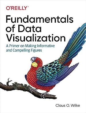
Paperback$15.74$15.74Delivery Sun, Sep 20 - Fundamentals of Data Visualization: A Primer on Making Informative and Compelling Figures
Paperback$47.00$47.00FREE delivery Mon, Sep 21 - Information Dashboard Design: Displaying Data for At-a-Glance Monitoring
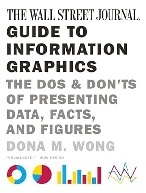
Hardcover$21.59$21.59Delivery Sun, Sep 20 - The Wall Street Journal Guide to Information Graphics: The Dos and Don'ts of Presenting Data, Facts, and Figures
Paperback$19.68$19.68Delivery Sun, Sep 20 - Effective Data Storytelling: How to Drive Change with Data, Narrative and Visuals
Hardcover$26.93$26.93Delivery Sun, Sep 20 - Visualize This: The FlowingData Guide to Design, Visualization, and Statistics
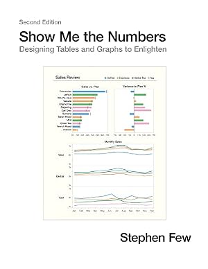
Paperback$21.40$21.40Delivery Sun, Sep 20 - Show Me the Numbers: Designing Tables and Graphs to Enlighten
Hardcover$20.30$20.30Delivery Sun, Sep 20 - Good Charts, Updated and Expanded: The HBR Guide to Making Smarter, More Persuasive Data Visualizations
Paperback$24.87$24.87Delivery Sun, Sep 20 - Dashboards That Deliver: How to Design, Develop, and Deploy Dashboards That Work
Paperback$18.10$18.10Delivery Sun, Sep 20 - DataStory: Explain Data and Inspire Action Through Story
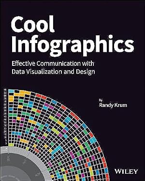
Paperback$24.98$24.98Delivery Sep 25 - Oct 1 - Cool Infographics: Effective Communication with Data Visualization and Design
Paperback$26.23$26.23Delivery Sun, Sep 20 - Practical Charts: The Essential Guide to Creating Clear, Compelling Charts for Reports and Presentations
Paperback$33.25$33.25Delivery Mon, Sep 21 - Data Visualization with Microsoft Power BI: How to Design Savvy Dashboards
Paperback$41.33$41.33FREE delivery Mon, Sep 21 - The Art of Insight: How Great Visualization Designers Think
Paperback$26.47$26.47Delivery Sun, Sep 20 - Avoiding Data Pitfalls: How to Steer Clear of Common Blunders When Working with Data and Presenting Analysis and Visualizations
Paperback$26.99$26.99Delivery Mon, Sep 21 - Effective Data Visualization: The Right Chart for the Right Data
Paperback$77.65$77.65FREE delivery Sun, Sep 20 - Visual Thinking: Empowering People and Organisations through Visual Collaboration
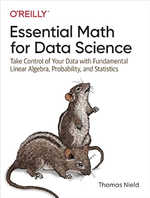
Paperback$22.28$22.28Delivery Sun, Sep 20 - Essential Math for Data Science: Take Control of Your Data with Fundamental Linear Algebra, Probability, and Statistics
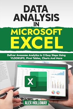
Paperback$36.22$36.22FREE delivery Mon, Sep 21 - Data Analysis in Microsoft Excel: Deliver Awesome Analytics in 3 Easy Steps Using VLOOKUPS, Pivot Tables, Charts And More
Paperback$19.99$19.99Delivery Mon, Sep 21 - Good Charts: The HBR Guide to Making Smarter, More Persuasive Data Visualizations
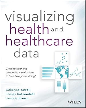
Paperback$28.83$28.83Delivery Thu, Sep 24 - Visualizing Health and Healthcare Data: Creating Clear and Compelling Visualizations to "See How You're Doing"
Paperback$27.58$27.58Delivery Mon, Sep 21 - R for Data Science: Import, Tidy, Transform, Visualize, and Model Data
Paperback$43.99$43.99FREE delivery Sun, Sep 20
Editorial Reviews
Review
This is an immensely practical guide to more effective communication through data visualization. From basic principles, to an extensive taxonomy of visualization types, to developing a style guide, this will be an invaluable and accessible read for anyone who needs to turn data into information. -- Mara Averick, RStudio
Too often, good data falls prey to bad or lazy visualizations. At last, an indispensable guide for presenting your work intelligibly and compellingly. -- DJ Patil, former U.S. chief data scientist
For many of us, it’s tough to understand data without visuals. But visualizing data is hard! This book is the authoritative guide. It’s terrific―and spectacularly useful. -- Cass R. Sunstein, Harvard Law School, and author of Too Much Information
A stellar variety and number of visualizations are included in these pages, an enjoyable-to-read encyclopedia of graphs. Jonathan Schwabish provides practical considerations for when to use which visual and thoughtful design guidelines in this excellent resource for those who work and communicate with data. You’ll be inspired and―as promised―learn better data visualization! -- Cole Nussbaumer Knaflic, author of Storytelling with Data: A Data Visualization Guide for Business Professionals
Navigating the myriad chart types available today can be a daunting experience. This book provides you with not only a guiding light but also an important foundation in the burgeoning field of data visualization. You will want to keep its set of principles and guidelines right next to you in your next project. -- Manuel Lima, author of The Book of Circles: Visualizing Spheres of Knowledge
Better Data Visualizations carefully teaches the reader when to use which type of visualization and why. This engaging book takes you from the basics to the entire breadth of today’s visualization methods. There are hundreds of clear, elegant, and varied visualizations to give you ideas for your own work. -- Max Roser, founder and director, Our World in Data
Better Data Visualizations is a practical guide to a large catalogue of chart types. No other book introduces the reader to specific chart types with such detail and finesse. It is an excellent resource for students, analysts, and researchers alike. -- Alberto Cairo, author of How Charts Lie: Getting Smarter About Visual Information
Not only is the book well designed from fonts to white space, it’s also well written and enjoyable to read. ― Technical Communication
About the Author
Product details
- Publisher : Columbia University Press
- Publication date : February 9, 2021
- Language : English
- Print length : 464 pages
- ISBN-10 : 0231193114
- ISBN-13 : 978-0231193115
- Item Weight : 2.5 pounds
- Dimensions : 7 x 1.2 x 8.9 inches
- Best Sellers Rank: #111,895 in Books (See Top 100 in Books)
- Customer Reviews:
About the author

Dr. Jonathan Schwabish is a Senior Fellow in the Tax and Income Supports Division at the Urban Institute, where his economic research focuses on retirement and nutrition policy. He is also a leading voice in the data visualization field and an advocate for clarity and accessibility in research communication. Dr. Schwabish has written extensively on best practices in data visualization, spanning technical production, design best practices, and strategies for making research and data analysis more accessible. Through his work, he helps nonprofits, research institutions, and governments at all levels improve how they communicate data and evidence to partners, constituents, and the public. He is the author of four books—Better Presentations, Elevate the Debate, Better Data Visualizations, and Data Visualization in Excel—which provide practical guidance for people looking to improve how they create, present, and communicate data-rich content.