Creating Actual Vs Target Chart In Excel With Floating Markers
Last Updated :
06 Dec, 2023
Excel is known to be a powerful tool for data visualization, comparison, storage, and management which can handle large amounts of data. We know that data can be visualized and compared using different kinds of plots and charts in Excel such as line charts, bar charts, etc. The tool is used to get insights from data using formulas and functions. It is primarily used by Accounting professionals to get insights into financial data, but it can be used by anyone for different purposes. Let's see how to create an Actual vs Target chart using floating markers:
For demonstration, let's use the below table values, which have actual sales and target sales for different years,

Actual vs Target Chart in Excel – Target Values as Bars
An Actual vs. Target chart is a tool that is used to compare two sets of data: the actual values achieved and the target values to be reached. This type of chart is widely used in situations, such as assessing sales performance, tracking revenue targets, and many more. There are various kinds of chats in Excel for data visualization, It makes it easy to identify areas where goals are exceeded or met, providing valuable insights for strategic planning and tracking for goals.
How to Create a Regular Chart in Excel (Column Chart)
Step 1: Select the Data
Step 2: Click on the 'Insert' tab and Select the chart to be created

Step 3: Preview Column Chart

Step 4: Right-click and Select Format Data Series

Step 5: Select "Secondary Axis" in the Plot Series options

Step 6: Preview Chart

Step 7: Select any Target Value bars, right-click, and select ‘Format Data Series
Step 8: Go to Format Data Series and Decrease or Increase the Gap Width
In the ‘Format Data Series’ pane, lower the Gap Width value, you can increase the width of the bars to make it wider than normal or can make them narrow as per your need, Here we've made the Gap width value higher to decrease the width of the bars

Step 9: Press the Delete key after clicking on the numbers of the secondary axis on the right side of the chart
This will give your chart a clean look.

Output
Now your chart is ready. After deleting the secondary axis, you will get the below as the final output.

Actual vs Target Chart in Excel – Target Values as Marker Lines
To get started, first, create a Column chart by replicating the same steps from Step 1 to Step 3 we've seen in the previous example, Then follow the Steps mentioned below:
Step 1: Right-click on any bar and select the 'change series chart type' option.

Step 2: In the change chart dialogue box, select the Combo category and then select the drop-down of target sales and choose the line marker chart.

Step 5: Press OK. The chart will appear like the one given below.

Step 6: Right-click the line and select the 'Format Data Series' option.

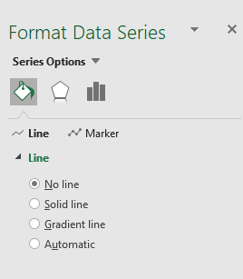
Step 7: From the dialogue box, under the Line section, select the 'No line' option.
Step 8: Under the Marker section, select the Built-in option and choose the marker '-'(dash) type, and set the size according to the choice.

Output

The actual sales are shown as blue bars and the target sales are shown as orange markers.
These two charts covered in this tutorial are the ones that I prefer when I have to display actual and target values in an Excel chart. I advise you to read more of our articles on Excel if you want to understand more. I appreciate your time and look forward to hearing from you soon!
Similar Reads
Actual vs Target Chart in Excel
Actual vs Target values are used to check whether the target value has been met or not. These types of charts are used in various organizations and companies where some type of target is to be achieved. Like these can be used to see whether actual sales value met the target sales values or not. Ther
3 min read
Creating a Gantt Chart With Milestones Using a Stacked Bar Chart In Excel
One of the most common and effective methods of displaying activities (tasks or events) plotted against time is a Gantt chart, which is frequently used in project management. On the left side of the chart is a list of the activities, and at the top is a suitable time scale. A bar is used to symboliz
3 min read
How to Create a Step Chart in Excel
A step chart is used to represent data that changes irregularly between time intervals. Now, Excel doesn't have a feature to create a Step Chart like the one shown below but we can create one by making some changes in our data. What is a Step Chart in ExcelA Step chart is the same as a Line Chart. T
4 min read
How to Create a Pareto Chart in Excel (Static And Dynamic)?
A Pareto Chart is a type of chart that contains both, a line chart and a bar chart where the cumulative total is represented by the line chart. They are generally used to find the defects to prioritize, in order to observe the greatest overall improvement. The chart is named for the Pareto principle
3 min read
How To Create Interactive Charts in Excel?
In MS Excel, we can draw various charts, but among them today, we will see the interactive chart. By name, we can analyze that the chart, which is made up of interactive features, is known as an interactive chart. In general, this chart makes the representation in a better and more user-friendly way
9 min read
How to Create a Dynamic Chart Range in Excel?
A Dynamic chart range is the range of a data set which automatically updates on any modifications in the original data set. It is beneficial because at some point in time we need to add or delete data from the original data set. So, we want a method to automatically update the chart on performing an
5 min read
How to Create a Goal Line on a Chart in Excel?
Excel is a powerful data visualization and management tool that can be used to store, analyze, and create reports on large data. Data can be visualized or compared using different kinds of plots in Excel such as line charts, bar charts, etc. A goal line is also called a target line. It helps show ac
2 min read
How to Create a Timeline or Milestone Chart in Excel?
A timeline is a type of chart that visually shows a series of events in chronological order over a linear timescale. The power of a timeline is that it is graphical, which makes it easy to understand critical milestones, such as the progress of a project schedule. Benefits of using Timeline / Milest
2 min read
How to Create a Thermometer Chart in Excel?
The Thermometer chart in Excel can be used to depict specific data based on the actual value and the target value. It can be used in a wide range of scenarios such as representing the past performance of horses in horse racing or the global temperature and it's variation throughout decades etc. In t
2 min read
How to Create a Chart from Multiple Sheets in Excel
Creating a chart from multiple sheets in Excel is a powerful way to consolidate data and visualize it in a meaningful way. Whether you're working with different datasets on separate sheets or need to compare data across multiple tabs, knowing how to create a chart from multiple sheets in Excel can s
5 min read