Angular PrimeNG Form MultiSelect Ellipsis Mode Component
Last Updated :
26 Apr, 2025
Angular PrimeNG is a collection of hundreds of UI components that can be used by developers to speed up the development process of their Applications. It is developed by PrimeTek Informatics also known as PrimeFaces. In this article, we will be discussing Angular PrimeNG Form MultiSelect Ellipsis Mode Component.
The MultiSelect Component allows users to select multiple options from the set of provided options. The Ellipsis mode is enabled by default in the Multiselect. In Ellipsis mode, the overflowed selected options are replaced by ellipsis (three dots). The ellipsis mode can be enabled explicitly by setting the selectedItemsLabel property to “ellipsis”.
Angular PrimeNG Form MultiSelect Ellipsis Mode Properties:
- options: This property of MultiSelect accepts an array of objects to display as MultiSelect options.
- selectedItemsLabel: This property is used to provide a template to indicate the overflow of the selected options. By default, it is set to “ellipsis” where it shows ellipsis to indicate content overflow.
- optionLabel: It is the property of the options object which will be used as the option label.
- defaultLabel: It is the placeholder that will get displayed when no item is selected.
- display: This property is used to display the selected items as chip by setting its value to “chip”
Syntax:
<p-multiSelect
    [options]="..."
    selectedItemsLabel="ellipsis"
    [(ngModel)]="..."
    optionLabel="..."
    defaultLabel="...">
</p-multiSelect>
Creating the Application and Installing the Required Modules:
Step 1: Create the Angular app using the following command.
ng new my_app
Step 2: After creating the app, move to the project folder using the below command.
cd new_app
Step 3: Finally, Install the following modules in your project directory
npm install primeng --save
npm install primeicons --save
Project Structure: The project structure will be shown in the picture below.

Project Structure
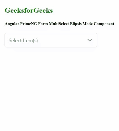
Example 1: This example illustrates the ellipsis mode of the MultiSelect component. Here, the overflown selected items will be indicated using ellipsis.
HTML
<h2 style="color: green;">
GeeksforGeeks
</h2>
<h5>
Angular PrimeNG Form MultiSelect
Ellipsis Mode Component
</h5>
<p-multiSelect
class="custom-ms"
[options]="items"
[(ngModel)]="selectedItems"
optionLabel="name"
defaultLabel="Select Item(s)">
</p-multiSelect>
|
Javascript
import { Component } from "@angular/core";
interface Item{
id: number;
name: string;
}
@Component({
selector: "app-root",
templateUrl: "./app.component.html",
styles: [
`
:host ::ng-deep .custom-ms
.p-multiselect-label {
width: 200px !important;
}
`
]
})
export class AppComponent {
items: Item[] = [];
selectedItems: Item[] = [];
ngOnInit()
{
this.items = [
{
name: "Wood",
id: 1
},
{
id: 2,
name: "Pen"
},
{
id: 3,
name: "Smartphone"
},
{
id: 4,
name: "Tablet"
},
{
id: 5,
name: "Pencil"
},
{
id: 6,
name: "Books"
},
];
}
}
|
Javascript
import { NgModule } from "@angular/core";
import { BrowserModule } from "@angular/platform-browser";
import { FormsModule } from "@angular/forms";
import { BrowserAnimationsModule }
from "@angular/platform-browser/animations";
import { AppComponent } from "./app.component";
import { MultiSelectModule} from "primeng/multiselect";
@NgModule({
imports: [
BrowserModule,
BrowserAnimationsModule,
MultiSelectModule,
FormsModule
],
declarations: [AppComponent],
bootstrap: [AppComponent],
})
export class AppModule { }
|
Output:
Example 2: In this article, we set the display mode of the MultiSelect to chip so the overflow chips will be indicated using ellipsis or three dots.
HTML
<h2 style="color: green;">
GeeksforGeeks
</h2>
<h5>
Angular PrimeNG Form MultiSelect
Ellipsis Mode Component
</h5>
<p-multiSelect
class="custom-ms"
[options]="items"
display="chip"
selectedItemsLabel="ellipsis"
[(ngModel)]="selectedItems"
optionLabel="name"
defaultLabel="Select Item(s)">
</p-multiSelect>
|
Javascript
import { Component } from "@angular/core";
interface Item{
id: number;
name: string;
}
@Component({
selector: "app-root",
templateUrl: "./app.component.html",
styles: [
`
:host ::ng-deep .custom-ms
.p-multiselect-label {
width: 250px !important;
}
`
]
})
export class AppComponent {
items: Item[] = [];
selectedItems: Item[] = [];
ngOnInit()
{
this.items = [
{
name: "Wood",
id: 1
},
{
id: 2,
name: "Pen"
},
{
id: 3,
name: "Smartphone"
},
{
id: 4,
name: "Tablet"
},
{
id: 5,
name: "Pencil"
},
{
id: 6,
name: "Books"
},
];
}
}
|
Javascript
import { NgModule } from "@angular/core";
import { BrowserModule } from "@angular/platform-browser";
import { FormsModule } from "@angular/forms";
import { BrowserAnimationsModule }
from "@angular/platform-browser/animations";
import { AppComponent } from "./app.component";
import { MultiSelectModule} from "primeng/multiselect";
@NgModule({
imports: [
BrowserModule,
BrowserAnimationsModule,
MultiSelectModule,
FormsModule
],
declarations: [AppComponent],
bootstrap: [AppComponent],
})
export class AppModule { }
|
Output:
Similar Reads
Angular PrimeNG Form MultiSelect Template Mode Component
Angular PrimeNG is a free and open-source framework with various components that Angular developers can use in their applications to enhance the user experience and speed up the development as they do not have to write everything from the ground up. In this article, we will be discussing Angular Pri
4 min read
Angular PrimeNG Form MultiSelect Ellipsis Mode Component
Angular PrimeNG is a collection of hundreds of UI components that can be used by developers to speed up the development process of their Applications. It is developed by PrimeTek Informatics also known as PrimeFaces. In this article, we will be discussing Angular PrimeNG Form MultiSelect Ellipsis Mo
4 min read
Angular PrimeNG Form MultiSelect Chips Display Component
Angular PrimeNG is a free and open-source framework with various components that Angular developers can use in their applications to enhance the user experience and speed up the development as they do not have to write everything from the ground up. In this article, we will be discussing Angular Pri
4 min read
Angular PrimeNG Form MultiSelect Grouped Component
PrimeNG is an AngularJS component library developed by PrimeFaces. It provides developers to select from a wide range of already implemented themes and UI components for their applications. In this article, we will see the Angular PrimeNG Form MultiSelect Grouped Component. The MultiSelect Component
4 min read
Angular PrimeNG Form MultiSelect Advanced with Templating and Filtering Component
Angular PrimeNG is an open-source framework with a rich set of native Angular UI components that are used for great styling and this framework is used to make responsive websites with very much ease. In this article, we will see how to use the Form MultiSelect Advanced with Templating and Filtering
4 min read
Angular PrimeNG Form MultiSelect Virtual Scrolling Component
Angular PrimeNG is an open-source framework with a rich set of native Angular UI components that are used for great styling and this framework is used to make responsive websites with very much ease. In this article, we will know how to use the Form MultiSelect Virtual Scrolling Component in Angular
4 min read
Angular PrimeNG Form MultiSelect Value Binding Component
PrimeNG is an AngularJS component library developed by PrimeFaces. It provides developers to select from a wide range of already implemented themes and UI components for their applications. In this article, we will discuss the Angular PrimeNG Form MultiSelect Value Binding Component. The MultiSelect
5 min read
Angular PrimeNG Form MultiSelect Disabled Options Component
Angular PrimeNG is a collection of hundreds of UI components that can be used by developers to speed up the development process of their Applications. It is developed by PrimeTek Informatics also known as PrimeFaces. In this article, we will be seeing the Angular PrimeNG Form MultiSelect Disabled Op
4 min read
Angular PrimeNG Form MultiSelect Custom Content Component
Angular PrimeNG is an open-source framework with a rich set of native Angular UI components that are used for great styling and this framework is used to make responsive websites with very much ease. In this article, we will learn how to use the Angular PrimeNG Form MultiSelect Custom Content Compon
4 min read
Angular PrimeNG Form MultiSelect Animation Configuration Component
Angular PrimeNG is a free and open-source framework with various components that Angular developers can use in their applications to enhance the user experience and speed up the development as they do not have to write everything from the ground up. In this article, we will see the Angular PrimeNG F
4 min read