Angular PrimeNG Form MultiSelect Grouped Component
Last Updated :
26 Apr, 2025
PrimeNG is an AngularJS component library developed by PrimeFaces. It provides developers to select from a wide range of already implemented themes and UI components for their applications. In this article, we will see the Angular PrimeNG Form MultiSelect Grouped Component.
The MultiSelect Component allows the user to select multiple options from the set of provided options. The grouping of the MultiSelect option allows us to group similar options together which helps users to find the relevant option quickly and betters the user experience. For grouping, the group property must be set to true.
Angular PrimeNG Form MultiSelect Grouped Mode Properties:
- options: This property is used to pass an array of objects to be displayed as MultiSelect options.
- group: This is a boolean property used to specify if the grouped mode is enabled or disabled.
- optionLabel: This is the property of the nested object of options which will be used as the label of the option.
- optionGroupLabel: This is the property of the options object which will be used as the label of the group.
- optionGroupChildren: This is the property of the options object which contains the group children.
- defaultLabel: This property accepts a string that is used as a placeholder when no item is selected.
Syntax:
<p-multiSelect
    [group]="true"
    [options]="..."
    [(ngModel)]="..."
    optionLabel="..."
    optionGroupLabel="..."
    optionGroupChildren="..."
    defaultLabel="...">
</p-multiSelect>
Creating the Application and Installing the Required Modules:
Step 1: Create the Angular app using the following command.
ng new my_app
Step 2: After creating the app, move to the project folder using the below command.
cd new_app
Step 3: Finally, Install the following modules in your project directory
npm install primeng --save
npm install primeicons --save
Project Structure: The project structure will be shown in the picture below.

Project Structure
Example 1: This is a simple example showing how to group Multiselect options together.
HTML
<h2 style="color: green;">
GeeksforGeeks
</h2>
<h5>
Angular PrimeNG Form MultiSelect
Grouped Component
</h5>
<p-multiSelect
class="custom-ms"
[group]="true"
[options]="itemGroups"
[(ngModel)]="selectedItems"
defaultLabel="Select Software(s)">
</p-multiSelect>
|
Javascript
import { Component } from "@angular/core";
import { SelectItemGroup } from "primeng/api";
@Component({
selector: "app-root",
templateUrl: "./app.component.html",
styles: [
`
:host ::ng-deep .custom-ms
.p-multiselect-label {
width: 300px !important;
}
`
]
})
export class AppComponent {
itemGroups: SelectItemGroup[] = [];
selectedItems: any[] = [];
ngOnInit() {
this.itemGroups = [
{
label: "Browsers",
items: [
{
label: "Chrome",
value: "web_1",
},
{
label: "Firefox",
value: "web_2"
},
{
label: "Edge",
value: "web_3",
},
]
},
{
label: "Creative Tools",
items: [
{
label: "Filmora",
value: "cre_1"
},
{
label: "Illustrator",
value: "cre_2",
},
{
label: "Photoshop",
value: "cre_3"
},
]
},
{
label: "IDEs",
items: [
{
label: "VS Code",
value: "ide_1",
},
{
label: "Atom",
value: "ide_2"
},
{
label: "Turbo C++",
value: "ide_3",
},
]
}
];
}
}
|
Javascript
import { NgModule } from "@angular/core";
import { BrowserModule } from "@angular/platform-browser";
import { FormsModule } from "@angular/forms";
import { BrowserAnimationsModule }
from "@angular/platform-browser/animations";
import { AppComponent } from "./app.component";
import { MultiSelectModule } from "primeng/multiselect";
@NgModule({
imports: [
BrowserModule,
BrowserAnimationsModule,
MultiSelectModule,
FormsModule
],
declarations: [AppComponent],
bootstrap: [AppComponent],
})
export class AppModule { }
|
Output:
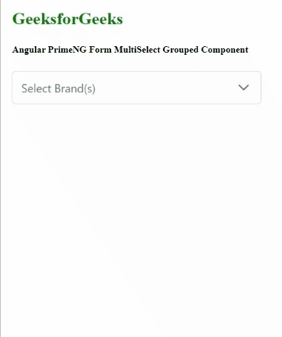
Example 2: This is another example illustrating the grouping of options together using grouped properties.
HTML
<h2 style="color: green;">
GeeksforGeeks
</h2>
<h5>
Angular PrimeNG Form MultiSelect
Grouped Component
</h5>
<p-multiSelect
class="custom-ms"
[group]="true"
[options]="brandGroups"
[(ngModel)]="selectedBrands"
display="chip"
optionLabel="name"
optionGroupLabel="groupName"
optionGroupChildren="brands"
defaultLabel="Select Software(s)">
</p-multiSelect>
|
Javascript
import { Component } from "@angular/core";
interface Brand {
name: string;
id: string;
}
interface BrandsGroup {
groupName: string;
brands: Brand[];
}
@Component({
selector: "app-root",
templateUrl: "./app.component.html",
styles: [
`
:host ::ng-deep .custom-ms
.p-multiselect-label {
width: 300px !important;
}
`
]
})
export class AppComponent {
brandGroups: BrandsGroup[] = [];
selectedBrands: Brand[] = [];
ngOnInit() {
this.brandGroups = [
{
groupName: "Sports",
brands: [
{
name: "Adidas",
id: "sports_1"
},
{
name: "Puma",
id: "sports_2"
},
{
name: "Nike",
id: "sports_3"
},
{
name: "HRX",
id: "sports_4"
},
]
},
{
groupName: "Transport",
brands: [
{
name: "Delhivery",
id: "trans_1"
},
{
name: "DHL",
id: "trans_2"
},
{
name: "FedEx",
id: "trans_3"
}
]
},
{
groupName: "Clothing",
brands: [
{
name: "Peter England",
id: "clothing_1"
},
{
name: "Allen Solly",
id: "clothing_2"
}
]
}
];
}
}
|
Javascript
import { NgModule } from "@angular/core";
import { BrowserModule } from "@angular/platform-browser";
import { FormsModule } from "@angular/forms";
import { BrowserAnimationsModule }
from "@angular/platform-browser/animations";
import { AppComponent } from "./app.component";
import { MultiSelectModule } from "primeng/multiselect";
@NgModule({
imports: [
BrowserModule,
BrowserAnimationsModule,
MultiSelectModule,
FormsModule
],
declarations: [AppComponent],
bootstrap: [AppComponent],
})
export class AppModule { }
|
Output:
Similar Reads
Angular PrimeNG Form MultiSelect Template Mode Component
Angular PrimeNG is a free and open-source framework with various components that Angular developers can use in their applications to enhance the user experience and speed up the development as they do not have to write everything from the ground up. In this article, we will be discussing Angular Pri
4 min read
Angular PrimeNG Form MultiSelect Ellipsis Mode Component
Angular PrimeNG is a collection of hundreds of UI components that can be used by developers to speed up the development process of their Applications. It is developed by PrimeTek Informatics also known as PrimeFaces. In this article, we will be discussing Angular PrimeNG Form MultiSelect Ellipsis Mo
4 min read
Angular PrimeNG Form MultiSelect Chips Display Component
Angular PrimeNG is a free and open-source framework with various components that Angular developers can use in their applications to enhance the user experience and speed up the development as they do not have to write everything from the ground up. In this article, we will be discussing Angular Pri
4 min read
Angular PrimeNG Form MultiSelect Grouped Component
PrimeNG is an AngularJS component library developed by PrimeFaces. It provides developers to select from a wide range of already implemented themes and UI components for their applications. In this article, we will see the Angular PrimeNG Form MultiSelect Grouped Component. The MultiSelect Component
4 min read
Angular PrimeNG Form MultiSelect Advanced with Templating and Filtering Component
Angular PrimeNG is an open-source framework with a rich set of native Angular UI components that are used for great styling and this framework is used to make responsive websites with very much ease. In this article, we will see how to use the Form MultiSelect Advanced with Templating and Filtering
4 min read
Angular PrimeNG Form MultiSelect Virtual Scrolling Component
Angular PrimeNG is an open-source framework with a rich set of native Angular UI components that are used for great styling and this framework is used to make responsive websites with very much ease. In this article, we will know how to use the Form MultiSelect Virtual Scrolling Component in Angular
4 min read
Angular PrimeNG Form MultiSelect Value Binding Component
PrimeNG is an AngularJS component library developed by PrimeFaces. It provides developers to select from a wide range of already implemented themes and UI components for their applications. In this article, we will discuss the Angular PrimeNG Form MultiSelect Value Binding Component. The MultiSelect
5 min read
Angular PrimeNG Form MultiSelect Disabled Options Component
Angular PrimeNG is a collection of hundreds of UI components that can be used by developers to speed up the development process of their Applications. It is developed by PrimeTek Informatics also known as PrimeFaces. In this article, we will be seeing the Angular PrimeNG Form MultiSelect Disabled Op
4 min read
Angular PrimeNG Form MultiSelect Custom Content Component
Angular PrimeNG is an open-source framework with a rich set of native Angular UI components that are used for great styling and this framework is used to make responsive websites with very much ease. In this article, we will learn how to use the Angular PrimeNG Form MultiSelect Custom Content Compon
4 min read
Angular PrimeNG Form MultiSelect Animation Configuration Component
Angular PrimeNG is a free and open-source framework with various components that Angular developers can use in their applications to enhance the user experience and speed up the development as they do not have to write everything from the ground up. In this article, we will see the Angular PrimeNG F
4 min read