A card is a bordered box with some padding around its content. It includes options for headers, footers, content, colors, etc. Cards include their own variant classes for quickly changing the background color and border color of a card.
Bootstrap 5 Card styles:
- Background and color: The background-color sets the background color of an element. It can manipulate the colors of the text as well as the background with ease. Example: bg-primary, bg-danger.
- Borders: Border used to quickly style the width, and color of the border and border-radius of an element.
- Mixins utilities: In this property, we include the card header and footer with the border and background colors. we can also change the color of the text.
Syntax:
<div class="row">
    <div class="card text-white" style="max-width: ...rem;">
        <div class="card-header">....</div>
        <div class="card-body">
            <h5 class="card-title">....</h5>
            <p class="card-text">...</p>
        </div>
    </div>
</div>
Example 1: In this example, we set the background and color of the card, using background classes.
HTML
<!DOCTYPE html>
<html lang="en">

<head>
    <meta charset="UTF-8">
    <meta http-equiv="X-UA-Compatible"
          content="IE=edge">
    <meta name="viewport"
          content="width=device-width, initial-scale=1.0">
    <title>Bootstrap 5-GeeksforGeeks </title>

    <link href=
"https://cdn.jsdelivr.net/npm/[email protected]/dist/css/bootstrap.min.css"
          rel="stylesheet">
    <script src=
"https://cdn.jsdelivr.net/npm/@popperjs/[email protected]/dist/umd/popper.min.js">
    </script>
    <script src=
"https://cdn.jsdelivr.net/npm/[email protected]/dist/js/bootstrap.min.js">
    </script>
</head>

<body class="m-3">
    <div class="container text-center ">
        <h1 class="text-success">GeeksforGeeks</h1>
        <h5>Bootstrap 5 Card styles</h5>
    </div>
    <div class="row border p-5 bg-light">
        <div class="card text-white bg-info"
            style="max-width: 15rem;">
            <div class="card-header">GeeksforGeeks</div>
            <div class="card-body">
                <h5 class="card-title">Info card</h5>
                <p class="card-text">
                    A Computer Science Portal.Geeksforgeeks
                    is a platform for learning tech related
                    topics.
                </p>
            </div>
        </div>
        <div class="card text-white bg-danger ms-2"
            style="max-width:15rem;">
            <div class="card-header">GeeksforGeeks</div>
            <div class="card-body">
                <h5 class="card-title">Danger card </h5>
                <p class="card-text">
                    A Computer Science Portal.Geeksforgeeks
                    is a platform for learning tech related
                    topics.
                </p>
            </div>
        </div>
        <div class="card text-white bg-success ms-2"
            style="max-width: 15rem;">
            <div class="card-header">GeeksforGeeks</div>
            <div class="card-body">
                <h5 class="card-title">Success card</h5>
                <p class="card-text">
                    A Computer Science Portal.
                    Geeksforgeeks is a platform
                    for learning tech related
                    topics.
                </p>
            </div>
        </div>
    </div>
</body>
</html>
Output:
 Bootstrap 5 Card styles
Example 2: In this example, we set the cards in the horizontal direction and changed the border color.
HTML
<!DOCTYPE html>
<html lang="en">

<head>
    <meta charset="UTF-8">
    <meta http-equiv="X-UA-Compatible"
          content="IE=edge">
    <meta name="viewport"
          content="width=device-width, initial-scale=1.0">
   <link href=
"https://cdn.jsdelivr.net/npm/[email protected]/dist/css/bootstrap.min.css"
        rel="stylesheet">
    <script src=
"https://cdn.jsdelivr.net/npm/@popperjs/[email protected]/dist/umd/popper.min.js">
    </script>
    <script src=
"https://cdn.jsdelivr.net/npm/[email protected]/dist/js/bootstrap.min.js">
    </script>
</head>

<body class="m-4">
    <div class="container text-center ">
        <h1 class="text-success">GeeksforGeeks</h1>
        <h5>Bootstrap 5 Card styles</h5>
    </div>
    <div class="row border p-5 bg-light">
        <div class="card border-secondary"
            style="max-width: 17rem;">
            <div class="card-header">Write GeeksforGeeks</div>
            <div class="card-body text-secondary">
                <h5 class="card-title">
                    Secondary card Border</h5>
                <p class="card-text">
                    Geeks for Geeks have online as well as
                    offline courses for on-demand topics like
                    C++.
                </p>
            </div>
        </div>
        <div class="card border-warning ms-3"
            style="max-width:17rem;">
            <div class="card-header">Write GeeksforGeeks</div>
            <div class="card-body text-warning">
                <h5 class="card-title">Warning card border</h5>
                <p class="card-text">
                    Geeks for Geeks have online as well
                    as offline courses for on-demand topics like
                    C++.
                </p>
            </div>
        </div>
        <div class="card border-dark ms-3"
            style="max-width:17rem;">
            <div class="card-header">
                Write Geeksforgeeks</div>
            <div class="card-body text-dark">
                <h5 class="card-title">Dark card Border</h5>
                <p class="card-text">
                    Geeks for Geeks have online as well
                    as offline courses for on-demand topics like
                    C++.
                </p>
            </div>
        </div>
        <div class="card border-danger ms-3"
            style="max-width:17rem;">
            <div class="card-header">
                Write GeeksforGeeks</div>
            <div class="card-body text-danger">
                <h5 class="card-title">Danger card Border</h5>
                <p class="card-text">
                    Geeks for Geeks have online as well as
                    offline courses for on-demand topics like
                    C++.
                </p>
            </div>
        </div>
    </div>
</body>
</html>
Output:
 Bootstrap 5 Card styles
Example 3: In this example, we illustrate the cards header, footer, and background color using .card classes.
HTML
<!DOCTYPE html>
<html lang="en">

<head>
    <meta charset="UTF-8">
    <meta http-equiv="X-UA-Compatible"
          content="IE=edge">
    <meta name="viewport"
          content="width=device-width, initial-scale=1.0">

    <link href=
"https://cdn.jsdelivr.net/npm/[email protected]/dist/css/bootstrap.min.css"
          rel="stylesheet">
    <script src=
"https://cdn.jsdelivr.net/npm/@popperjs/[email protected]/dist/umd/popper.min.js">
    </script>
    <script src=
"https://cdn.jsdelivr.net/npm/[email protected]/dist/js/bootstrap.min.js">
    </script>
</head>

<body class="m-4">
    <div class="container text-center ">
        <h1 class="text-success">
            GeeksforGeeks</h1>
        <h5>Bootstrap 5 Card styles</h5>
    </div>
    <div class="row border p-5 bg-light text-center">
        <div class="card border-warning" style="max-width:15rem;">
            <div class="card-header text-bg-primary border-info">
                GeeksforGeeks
            </div>
            <div class="card-body text-danger">
                <p class="card-text">
                    Learn Data Structures and Algorithms
                    Online at Your Own Pace with GeeksforGeeks DSA
                    Course.
                </p>
                <button type="button"
                    class="btn btn-success">
                    Sign In
                </button>
            </div>
            <div class="card-footer text-bg-secondary
                border-danger">
                Practice Geeks for Geeks
            </div>
        </div>
        <div class="card border-primary ms-4"
            style="max-width:15rem;">
            <div class="card-header bg-light border-info">
                About GeeksforGeeks
            </div>
            <div class="card-body text-primary">
                <p class="card-text">
                    Geeks for Geeks is a computer science portal
                </p>
                <button type="button" class="btn btn-danger">
                    Done
                </button>
            </div>
            <div class="card-footer text-bg-success
                border-primary">
                Home Geeks for Geeks
            </div>
        </div>
    </div>
</body>
</html>
Output:
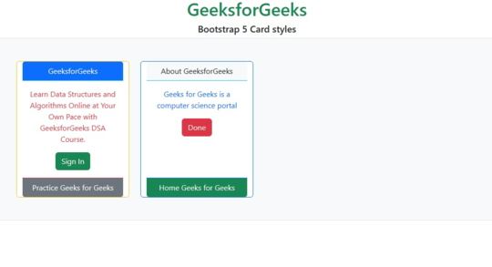 Bootstrap 5 Card styles
Reference: https://getbootstrap.com/docs/5.0/components/card/#card-styles
Similar Reads
Bootstrap 5 Cards Body Bootstrap 5 Cards Body is used to create the card's body is the main part of the card which contains the title, sub-title all the things that a card contains. Bootstrap 5 Cards Body Class: card-body: This class is used for creating the body of the card. Syntax: <div class="card"> <div class
2 min read
Bootstrap 5 Cards Titles, text, and links Cards Titles, text, and links are used to add a title, text content, and links to a card. The .card-title class is used with <h*> tag to create the card title and the .card-subtitle class is used with <h*> tag to create the card subtitle. Similarly, the .card-link class is used with <
2 min read
Bootstrap 5 Cards Images Bootstrap 5 Cards Images facilitates adding the image to the card, which may contain the content. The image can be appended to either of the ends of the card or can be overlayed the image with the card content, or can be simply embedded into the card. Images enhance the appearance of the card and ma
3 min read
Bootstrap 5 Cards List groups Bootstrap 5 Cards List groups are used to create a group of lists inside the card to show information like features, pricing, and many more. Cards List groups used Classes: No special classes are used in List groups. You can customize the component using List groups classes. Syntax: <div class="c
2 min read
Bootstrap 5 Cards Kitchen sink The card is a component provided by Bootstrap 5 which provides a flexible and extensible content container with multiple variants and options. It includes options for headers and footers. Cards support a wide variety of content, including images, text, list groups, links, and more. The kitchen sink
2 min read
Bootstrap 5 Cards Sizing Bootstrap Cards Sizing refers to the ability to control the dimensions of cards in Bootstrap by using predefined classes such as col, col-sm, col-md, col-lg, col-xl, and col-xxl. This ensures consistency and responsiveness across various screen sizes, maintaining a uniform appearance for card elemen
2 min read
Bootstrap 5 Cards Sizing using Utilities Bootstrap 5 Cards Using utilities: The height and weight of the card can be set up using card utilities. We can use classes like w-* and h-* to set the width and height of the card respectively. This * can be substituted with the required percentage value. Bootstrap 5 Cards Sizing using utilities Cl
2 min read
Bootstrap 5 Cards Sizing using custom CSS Bootstrap 5 card component provides a flexible and extensible content container with multiple variants and options. It includes options for headers and footers. Cards support a wide variety of content, including images, text, list groups, links, and more. Cards using custom CSS is used to set the cu
2 min read
Bootstrap 5 Cards Text Alignment A card is a flexible and extensible content container that shows the information overview shortly. We can resize the card container, align text as we want, and add images. We can change the alignment of the text of the card using text align classes. We can change specific entity alignment. We can us
2 min read
Bootstrap 5 Cards Navigation Bootstrap 5 Cards navigation refers to a user interface design pattern where related information is organized into individual cards that can be interacted with and rearranged for easy viewing and access. This approach is commonly used in mobile app design and website design for a visually appealing
2 min read