The CSS columns property is used to control both the number of columns and the width of those columns in a layout. It’s a shorthand property that allows you to set multiple values at once, such as the number of columns and their width.
This makes it easier to create multi-column layouts without manually defining each column’s style.
Try It:
3 Columns
2 Columns
Auto Columns
Currently Active Property:
columns: 3;
Syntax
columns: column-width columns-count | auto | initial | inherit;
Property Values
Here are the Property Values for the CSS columns Property:
| Property Value | Description |
|---|
auto | Sets the column-width and column-count to their default values defined by the browser. |
integer | Specifies the column-width and column-count using integer values. |
initial | Initializes the column-width and column-count values to their default initial values. |
inherit | Inherits the column-width and column-count values from its parent element. |
CSS columns Property Examples
Here are the Examples of the columns Property:
Example 1: CSS columns Property with Automatic Column Distribution
In this example, the columns property is used to split the content into multiple columns, where the number of columns and their width are automatically determined by the browser. The content inside the div with the class GFG will be laid out in as many columns as the browser can fit, based on the available space and content.
HTML
<!DOCTYPE html>
<html>
<head>
<title>CSS | columns Property</title>
<style>
body {
text-align: center;
color: green;
}
.GFG {
-webkit-columns: auto auto;
/* Chrome, Safari, Opera */
-moz-columns: auto auto;
/* Firefox */
columns: auto auto;
}
</style>
</head>
<body>
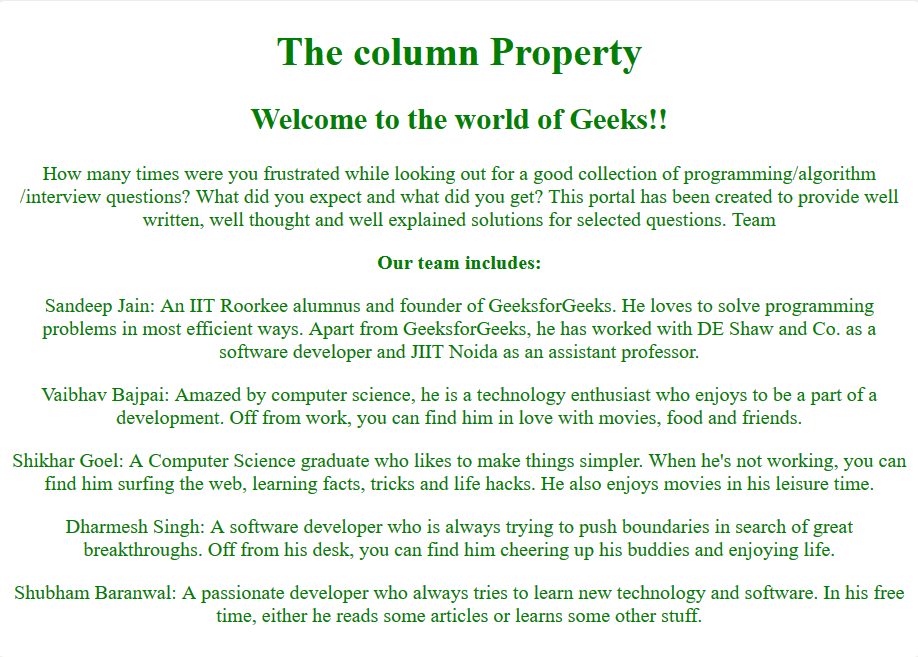
<h1>The column Property</h1>
<div class="GFG">
<h2>
Welcome to the world of Geeks!!
</h2>
How many times were you frustrated
while looking out for a good
collection of
programming/algorithm/interview
questions? What did you expect and
what did you get? This portal has been
created to provide well written, well
thought and well-explained solutions
for selected questions.
<div>
<strong>Our team includes:</strong>
<p>
Sandeep Jain: An IIT Roorkee
alumnus and founder of
GeeksforGeeks. He loves to
solve programming problems in
most efficient ways. Apart
from GeeksforGeeks, he has
worked with DE Shaw and Co. as
a software developer and JIIT
Noida as an assistant
professor.
</p>
<p>
Vaibhav Bajpai: Amazed by
computer science,he is a
technology enthusiast who
enjoys being a part of a
development. Off from work,
you canfind him in love with
movies, food, and friends.
</p>
<p>
Shikhar Goel: A Computer
Science graduate who likes to
make things simpler. When he's
not working, you can find him
surfing the web, learning
facts, tricks and life hacks.
He also enjoys movies in his
leisure time.
</p>
<p>
Dharmesh Singh: A software
developer who is always trying
to push boundaries in search
of great breakthroughs. Off
from his desk, you can find
him cheering up his buddies
and enjoying life.
</p>
<p>
Shubham Baranwal: A passionate
developer who always tries to
learn new technology and
software. In his free time,
either he reads some articles
or learns some other stuff.
</p>
</div>
</div>
</body>
</html>
Output:
Note: If any of the values among the column-width and column-count are not specified, then the browser assumes their value as auto by default.
integer: This is used to specify the column-width and the column-count using integer values.
Example 2: CSS columns Property for Multi-Column Layout
In this example, we use the CSS columns property to create a multi-column layout. The text content inside the div with the class GFG is split into five columns, each with a minimum width of 60px. The columns property works across browsers, with specific vendor prefixes for better compatibility.
HTML
<!DOCTYPE html>
<html>

<head>
    <title>CSS | columns Property</title>
    <style>
        body {
            text-align: center;
            color: green;
        }

        .GFG {
            -webkit-columns: 60px 5;
            /* Chrome, Safari, Opera */
            -moz-columns: 60px 5;
            /* Firefox */
            columns: 60px 5;
        }
    </style>
</head>

<body>
    <h1>The column Property</h1>
    <div class="GFG">
        <h2>
            Welcome to the world of Geeks!!
        </h2>
        How many times were you frustrated
        while looking out for a good
        collection of
        programming/algorithm/interview
        questions? What did you expect and
        what did you get? This portal has been
        created to provide well written, well
        thought and well-explained solutions
        for selected questions.
        <div>
            <strong>Our team includes:</strong>
            <p>
                Sandeep Jain: An IIT Roorkee
                alumnus and founder of
                GeeksforGeeks. He loves to
                solve programming problems in
                most efficient ways. Apart
                from GeeksforGeeks, he has
                worked with DE Shaw and Co. as
                a software developer and JIIT
                Noida as an assistant
                professor.
            </p>
            <p>
                Vaibhav Bajpai: Amazed by
                computer science,he is a
                technology enthusiast who
                enjoys being a part of a
                development. Off from work,
                you canfind him in love with
                movies, food, and friends.
            </p>
            <p>
                Shikhar Goel: A Computer
                Science graduate who likes to
                make things simpler. When he's
                not working, you can find him
                surfing the web, learning
                facts, tricks and life hacks.
                He also enjoys movies in his
                leisure time.
            </p>
            <p>
                Dharmesh Singh: A software
                developer who is always trying
                to push boundaries in search
                of great breakthroughs. Off
                from his desk, you can find
                him cheering up his buddies
                and enjoying life.
            </p>
            <p>
                Shubham Baranwal: A passionate
                developer who always tries to
                learn new technology and
                software. In his free time,
                either he reads some articles
                or learns some other stuff.
            </p>
        </div>
    </div>
</body>

</html>
Output:

Supported Browser
The browsers supported by columns Property are listed below:
Note: Ensure to test on older browser versions for compatibility, as some may require vendor prefixes (-webkit, -moz) for full functionality.
Similar Reads
CSS @charset Rule The @charset rule specifies the character encoding used in the style sheet. The @charset must be the first element in the style sheet and if several @charset rules are defined then the only first one is used. It can not be used in the <style> element where the character set of the HTML page is
3 min read
CSS @keyframes Rule The CSS @keyframes rule defines animations by specifying keyframes that describe the styles to be applied at various points during the animation duration. It allows for smooth transitions and transformations in web elements, controlled through percentages or from-to values.Note:For optimal browser s
3 min read
CSS @media Rule The @media CSS at-rule is used to apply a different set of styles for different media/devices using the Media Queries. A Media Query is mainly used to check the height, width, resolution, and orientation(Portrait/Landscape) of the device. This CSS rule is a way out for making more out of responsive
5 min read
CSS align-content property The align-content property changes the behavior of the flex-wrap property. It aligns flex lines. It is used to specify the alignment between the lines inside a flexible container. This property defines how each flex line is aligned within a flexbox and is only applicable if flex-wrap: wrap is applie
4 min read
CSS align-items Property The align-items property in CSS is used to align flex items along the cross-axis within a flex container. It accepts values like flex-start, flex-end, center, baseline, and stretch, controlling the vertical alignment of items in a flexbox.Syntaxalign-items: normal | stretch | center | flex-start | f
7 min read
CSS align-self Property The align-self property in CSS is used to align the selected items in the flexible container in many different manners such as flex-end, center, flex-start, etc. Syntax:align-self: auto|normal|self-start|self-end|stretch|center |baseline, first baseline, last baseline|flex-start |flex-end|baseline|s
5 min read
CSS all Property The all property in CSS is the shorthand property used to set all the element's values to their initial or inherited values or in some cases used to set the values to another spreadsheet origin. This property is used to reset all the CSS properties in a document.Syntax:Â all: initial|inherit|unset|re
3 min read
CSS animation-delay Property The animation-delay property specifies a delay for the start of an animation. Defined in seconds (s) or milliseconds (ms), this value determines how long to wait before beginning the animation. Negative values start the animation as if it had already been playing for the specified duration.Syntaxani
3 min read
CSS animation-direction Property The animation-direction CSS property sets whether an animation should play forward, backward, or alternate back and forth between playing the sequence forward and backward. It controls the visual flow and repetition behavior of animations in web pages, enhancing dynamic content presentation.Syntaxan
4 min read
CSS animation-duration Property The animation-duration property in CSS is essential for controlling the length of time an animation takes to complete one cycle, making it a vital tool for creating dynamic and engaging web designs.Syntax:animation-duration: time | initial | inherit;Property Value:time: This value is used to specify
3 min read