Sharing and Publishing Visualizations with Altair
Last Updated :
18 Aug, 2025
Altair is a powerful Python library for creating interactive data visualizations. Built on the Vega-Lite grammar, it follows a declarative approach, allowing users to specify what to display rather than how to render it. This simplifies the creation of complex visualizations, especially in interactive environments like Jupyter Notebooks and Google Colab. Altair also offers flexible sharing options, enabling charts to be embedded in web pages, exported as static images or published on platforms like GitHub and content management systems (CMSs).
1. Displaying Altair Charts
Altair visualizations are rendered using a JavaScript frontend, making them especially suited for environments like Jupyter Notebooks, JupyterLab, and Google Colab. These environments combine a Python backend with a JavaScript frontend, facilitating seamless chart display.
2. Renderer Framework
Altair provides a flexible renderer system to switch between output formats based on the environment:
- HTML Renderer: The default output, generating HTML with JavaScript dependencies. It requires an internet connection.
- Mimetype Renderer: Outputs a Vega-Lite-specific mimetype for platforms without JS support.
- Jupyter Renderer: Enables offline interactivity inside Jupyter environments.
Saving Altair Charts: Exporting Visualizations
Altair visualizations can be exported to various formats including HTML, PNG and SVG, which are useful for different sharing and embedding needs.
1. Exporting to HTML
HTML export allows embedding charts in web pages or sharing via links.
Python
import altair as alt
import pandas as pd

data = pd.DataFrame({
    'x': range(10),
    'y': range(10),
    'z': [i**2 for i in range(10)], # Color
    'category': ['A', 'B'] * 5  # Shape
})

chart = alt.Chart(data).mark_line(point=True).encode(
    x=alt.X('x:O', title='X Axis Label'),
    y=alt.Y('y:O', title='Y Axis Label'),
    color=alt.Color('z:Q', scale=alt.Scale(scheme='viridis'), title='Z Values'),  # Color
    shape=alt.Shape('category:N', title='Category'),
    tooltip=['x:O', 'y:O', 'z:Q', 'category:N']
).properties(
    title='Enhanced Altair Chart', width=600, height=400
).interactive()
chart.save('enhanced_chart.html')
Output
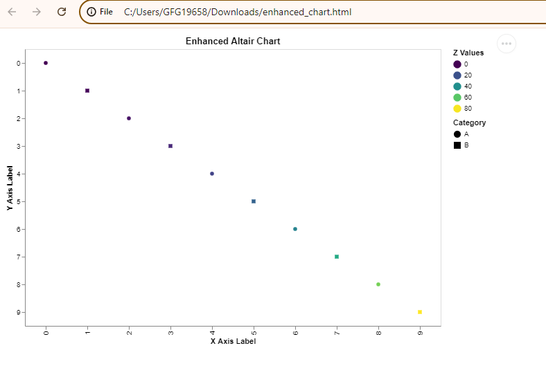 Exporting to HTML
Explanation: Creates a line chart with points, colored by x² and shaped by category, with zoom/pan via .interactive() and export to enhanced_chart.html.
2. Exporting to PNG and SVG
For exporting to PNG or SVG formats, you need additional libraries such as selenium and pillow. We will use the vl-convert-python package. This package allows you to convert Vega-Lite chart specifications into static images without additional dependencies.
First, ensure that you have the necessary libraries installed. You can install them using pip:
!pip install altair vl-convert-python vega-datasets
Create and Export Altair Chart:
Python
import altair as alt
from vega_datasets import data
import vl_convert as vlc

chart = alt.Chart(data.cars.url).mark_point().encode(
    x='Horsepower:Q',
    y='Miles_per_Gallon:Q',
    color='Origin:N'
)

chart_json = chart.to_json()
svg_str = vlc.vegalite_to_svg(chart_json)
with open("chart.svg", "w") as f:
    f.write(svg_str)

png_data = vlc.vegalite_to_png(chart_json)
with open("chart.png", "wb") as f:
    f.write(png_data)
Output
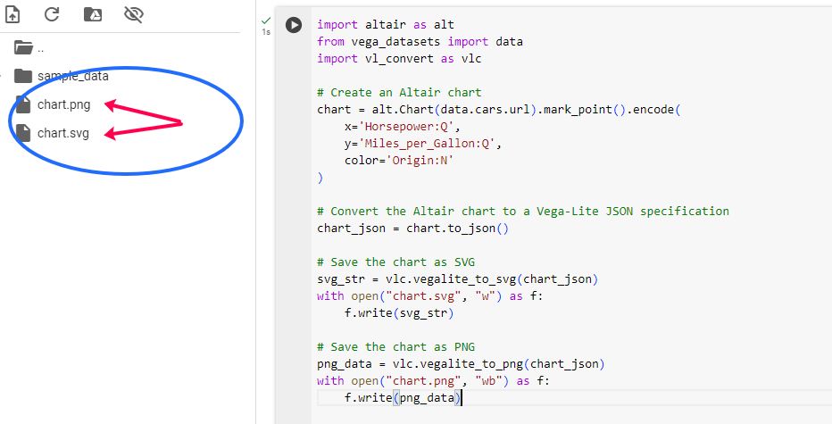 Exporting to PNG and SVG
Explanation:
- Chart Creation: An Altair chart is built using the vega_datasets library.
- Exporting: The vl-convert-python package converts the chart's Vega-Lite JSON to SVG and PNG.
- vegalite_to_svg() generates and saves an SVG file and vegalite_to_png() generates and saves a PNG file.
Publishing Altair Visualizations
Publishing visualizations involves making them accessible to a broader audience through various platforms and media. Here are some methods to publish your Altair charts.
1. Sharing via GitHub
GitHub is a popular platform for sharing code and data visualizations. Altair visualizations can be included in GitHub repositories in several ways:
- HTML Files: Export Altair charts as HTML and upload to your GitHub repository.
- Jupyter Notebooks: Embed Altair visualizations directly in notebooks and push to GitHub. GitHub renders them nicely.
- GitHub Pages: Host HTML files as a static website for interactive sharing.
2. Integrating with Content Management Systems (CMS)
Altair visualizations can be integrated with content management systems (CMS) like WordPress, Drupal, or Joomla. This is particularly useful for bloggers or content creators who want to embed interactive visualizations in their posts.
- Using iFrames: One straightforward way to embed Altair visualizations in a CMS is by using an iframe. Export your chart to an HTML file, upload it to a web server, and then embed it using an iframe tag:
<iframe src="path_to_your_chart.html" width="600" height="400"></iframe>
- CMS Plugins: Some CMS platforms have plugins that allow you to embed HTML content or custom code, which can be used to embed Altair charts.
Data science platforms like Kaggle and Google Colab support Jupyter Notebooks, making them excellent choices for sharing Altair visualizations. By uploading your notebooks to these platforms, you can share your work with the data science community.
- Kaggle: Create a new Kaggle kernel and upload your notebook containing Altair visualizations. Kaggle supports interactive visualizations, allowing others to interact with your charts.
- Google Colab: Google Colab is similar to Kaggle but hosted on Google’s infrastructure. You can share Colab notebooks via links, and they will retain interactivity.
Best Practices for Sharing and Publishing Altair Visualizations
1. Ensuring Interactivity
When sharing Altair visualizations, interactivity is often a key feature. To ensure that your visualizations remain interactive:
- Use the HTML export option: This preserves the full interactivity of the chart.
- Avoid static image formats: While PNG or SVG exports are useful for non-interactive mediums, they lose the interactive capabilities of Altair charts.
Interactive visualizations can be resource-intensive, especially with large datasets. To optimize performance:
- Limit data size: Preprocess your data to include only the necessary information for the visualization.
- Use efficient encodings: Choose encoding types that are optimal for performance. For instance, avoid using complex transformations directly in the chart if they can be precomputed.
Ensure that your visualizations are compatible across different platforms and devices:
- Test on multiple browsers: Before sharing, test your HTML visualizations on different web browsers to ensure consistent performance.
- Responsive design: Consider the size and layout of your charts to ensure they display well on both desktop and mobile devices.