Adding a Subtitle to an Altair-Generated Chart
Last Updated :
23 Jul, 2025
Altair is a powerful Python library for creating declarative statistical visualizations. While it’s known for its simplicity and flexibility, one common question that arises is how to add a subtitle to a chart. While Altair makes it easy to add titles, subtitles require a bit more work since they aren’t directly supported as a simple parameter. However, with a little creativity, you can still effectively add subtitles to your Altair charts. This article will guide you through the steps to do just that.
Understanding Altair and Vega-Lite
Altair is built on top of Vega and Vega-Lite, which are visualization grammars designed to create complex visualizations in a concise manner. While Altair provides an intuitive interface for creating charts, certain features, such as subtitles, are not natively supported due to constraints in Vega-Lite.
Why Add Subtitles for an Altair Chart?
Subtitles can provide additional context or explanations that complement the main title of a chart. They are useful for:
- Clarifying the Data: Offering more details about the data source or methodology.
- Enhancing Comprehension: Providing insights that help the audience understand the chart better.
- Adding Context: Explaining the relevance of the chart in a broader context.
Workarounds for Adding Subtitles
Although Altair does not directly support subtitles, there are a few techniques you can use to simulate this feature.
1. Using alt.Title Object
One of the simplest ways to add a subtitle is by using the alt.Title object. This method involves defining both the title and subtitle within the title parameter of the chart.
Python
import altair as alt
from vega_datasets import data

source = data.cars.url

# Create a chart with a title and subtitle
chart = alt.Chart(source).mark_point().encode(
    x='Horsepower:Q',
    y='Miles_per_Gallon:Q'
).properties(
    title=alt.TitleParams(
        text='Cars Data',
        subtitle='Analysis of Horsepower vs. Miles per Gallon'
    )
)

chart
Output:
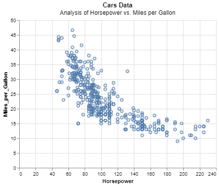 Workarounds for Adding Subtitles
This code snippet demonstrates how to use alt.TitleParams to include a subtitle alongside the main title
2. Concatenating Text Elements
Another approach is to concatenate text elements to simulate a subtitle. This involves creating a separate text mark for the subtitle and layering it with the main chart.
Python
import altair as alt
from vega_datasets import data

source = data.cars.url

# Main chart
main_chart = alt.Chart(source).mark_point().encode(
    x='Horsepower:Q',
    y='Miles_per_Gallon:Q'
)

# Subtitle as a separate text mark
subtitle = alt.Chart().mark_text(
    align='center',
    baseline='top',
    dx=0,
    dy=20  # Adjust position as needed
).encode(
    text=alt.value('Analysis of Horsepower vs. Miles per Gallon')
).properties(
    width=400,
    height=30
)

# Concatenate the main chart and subtitle
chart_with_subtitle = alt.vconcat(subtitle, main_chart)

chart_with_subtitle
Output:
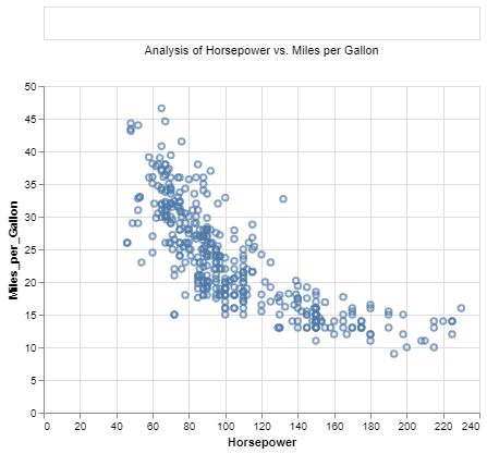 Concatenating Text Elements
This method allows for greater flexibility in styling and positioning the subtitle.
Customizing Subtitle Appearance
Once you have added a subtitle, you can customize its appearance using various configuration options:
- Font and Size: Adjust the font type and size to ensure readability.
- Color: Use contrasting colors to make the subtitle stand out.
- Alignment: Align the subtitle with the main title for a cohesive look.
Python
chart = alt.Chart(source).mark_point().encode(
    x='Horsepower:Q',
    y='Miles_per_Gallon:Q'
).properties(
    title=alt.TitleParams(
        text='Cars Data',
        subtitle='Analysis of Horsepower vs. Miles per Gallon',
        fontSize=16,
        font='Courier',
        color='gray',
        subtitleFontSize=12,
        subtitleFontStyle='italic',
        subtitleColor='darkgray'
    )
)
chart
Output:
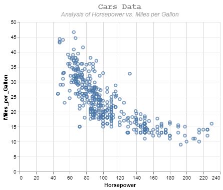 Customizing Subtitle Appearance
Conclusion
While Altair does not natively support subtitles due to limitations in Vega-Lite, creative workarounds such as using the alt.Title object or concatenating text elements can be employed to achieve the desired effect. These methods allow you to enhance your visualizations by providing additional context and clarity, making your charts more informative and engaging.