Setting Axis FontSize in Altair
Last Updated :
23 Jul, 2025
Customizing the appearance of your visualizations is an essential part of creating clear, effective, and aesthetically pleasing charts. In Altair, one of the key customization options available is adjusting the font size of your chart’s axes. This article will guide you through the process of setting the axis font size in Altair, providing you with example code and best practices to ensure your visualizations are both informative and visually appealing.
Understanding Altair's Axis Customization
Altair provides several options for customizing the appearance of axes, including the ability to set font sizes for axis labels and titles.
- These customizations are done using the
Axis class, which allows you to specify various properties of the axis, including labelFontSize and titleFontSize. - Properly adjusting font sizes can significantly enhance the readability of your charts, making them more accessible and easier to understand.
Why Adjust Font Size?
- Improved Readability: Larger font sizes can make axis labels easier to read, especially when presenting your charts on larger screens or in printed materials.
- Aesthetics: Consistent and appropriately sized fonts contribute to the overall aesthetic quality of your visualizations.
- Clarity: Ensuring that text elements are clearly visible and appropriately sized helps convey the information more effectively.
Setting Axis Font Size in Altair
In Altair, you can customize the font size of axis labels by using the configure_axis method. This method allows you to set various properties of the axis, including the font size, font family, and color of the axis labels.
Syntax Overview:
alt.Chart(data).mark_type().encode(
    x='x_column',
    y='y_column'
).configure_axis(
    labelFontSize=font_size_value,
    titleFontSize=font_size_value
)
- labelFontSize: This parameter controls the font size of the axis labels (the numbers or text along the axis).
- titleFontSize: This parameter controls the font size of the axis title (the descriptive text that labels the entire axis).
Example Code for Adjusting Axis Font Size
Let’s walk through a simple example where we adjust the axis font size of a basic Altair chart:
Python
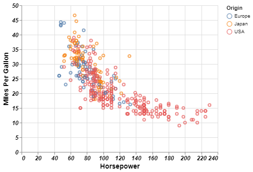
chart = alt.Chart(cars).mark_point().encode(
    x=alt.X('Horsepower', axis=alt.Axis(title='Horsepower', labelFontSize=12, titleFontSize=14)),
    y=alt.Y('Miles_per_Gallon', axis=alt.Axis(title='Miles Per Gallon', labelFontSize=12, titleFontSize=14)),
    color='Origin'
).configure_axis(
    labelFontSize=12,
    titleFontSize=14
)

chart
Output:
 Customizing Axis Font Size
In this example:
labelFontSize is set to 12 for both axes, which adjusts the size of the tick labels.titleFontSize is set to 14, which adjusts the size of the axis titles.
Advanced Customizations for Axis Font Size
Altair allows for more advanced customization options if needed. These include setting the font style, weight, and color. Here’s how you can do it:
Python
chart = alt.Chart(cars).mark_point().encode(
    x=alt.X('Horsepower', axis=alt.Axis(title='Horsepower', labelFontSize=12, titleFontSize=14, labelFontStyle='italic', labelFontWeight='bold')),
    y=alt.Y('Miles_per_Gallon', axis=alt.Axis(title='Miles Per Gallon', labelFontSize=12, titleFontSize=14, labelFontStyle='italic', labelFontWeight='bold')),
    color='Origin'
).configure_axis(
    labelFontSize=12,
    titleFontSize=14,
    labelFontStyle='italic',
    labelFontWeight='bold'
)

chart
Output:
 Customizations for Axis Font Size
Best Practices for Font Size Adjustment
When adjusting font sizes in your Altair charts, keep the following best practices in mind:
- Maintain Readability: Ensure that your axis labels and titles are large enough to be easily read, especially when presenting your visualizations on larger screens or in print. Avoid making the font size too small, as it can make the chart difficult to interpret.
- Consistency Across Charts: If you’re creating multiple charts for the same presentation or report, maintain consistent font sizes across all charts. This consistency helps create a unified and professional look.
- Consider the Audience: Adjust the font size based on your target audience. If your charts are meant for a presentation to a large group, larger fonts are preferable. For detailed reports viewed on individual screens, smaller but still readable fonts may suffice.
- Balance with Other Visual Elements: The font size of the axis labels and titles should be balanced with other visual elements, such as data points and gridlines. Overly large fonts can overwhelm the chart, while too small fonts might get lost among the other elements.
Conclusion
Adjusting the axis font size in Altair is a simple yet powerful way to enhance the readability and overall aesthetics of your visualizations. By using the configure_axis method, you can easily customize the font size of both the axis labels and titles, ensuring your charts are clear and effective.