How to Show a Histogram of Percentages Instead of Counts Using Altair
Last Updated :
23 Jul, 2025
Altair is a powerful declarative visualization library in Python, based on the Vega and Vega-Lite visualization grammars. One common use case is creating histograms to visualize the distribution of a dataset. Typically, histograms display counts of data points within each bin. However, in some cases, it may be more informative to show the distribution as percentages. This article will walk through how to create a histogram in Altair that displays percentages instead of raw counts.
Understanding Histograms in Altair
Histograms are a type of bar chart that represent the distribution of numerical data by dividing the data into bins. Each bin is represented by a bar, and the height of the bar indicates the number of data points within that bin. In Altair, creating a histogram is straightforward and involves specifying the data, defining the bins, and encoding the axes.
Why Use Percentages Instead of Counts?
Using percentages instead of counts in histograms can be beneficial for several reasons:
- Relative Comparison: Percentages allow for easier comparison between different datasets or groups, as they normalize the data.
- Scalability: Percentages make it easier to interpret data when dealing with large datasets or varying sample sizes.
- Clarity: For audiences unfamiliar with the raw data, percentages can provide a clearer picture of the distribution.
To transform the histogram from counts to percentages, we need to perform a few additional steps. This involves using Altair's transform operations to calculate the percentage each bin contributes to the total data points.
Before diving into percentages, let's review how to create a basic histogram using Altair. We'll use a simple dataset for demonstration.
Step 1: Install and Import Altair
If you haven't already installed Altair, you can do so using pip:
Python
Then, import the necessary libraries:
Python
import altair as alt
import pandas as pd
import numpy as np
Step 2: Create a Sample Dataset
For this example, let's create a sample dataset of normally distributed values:
Python
# Create a sample dataset
np.random.seed(42)
data = pd.DataFrame({
    'value': np.random.randn(1000)  # 1000 random numbers from a normal distribution
})
Step 3: Create a Histogram with Counts
First, let's create a standard histogram that displays the count of data points in each bin:
Python
# Standard histogram showing counts
histogram = alt.Chart(data).mark_bar().encode(
    alt.X('value:Q', bin=True, title='Value'),
    alt.Y('count()', title='Count')
).properties(
    title='Histogram of Values (Counts)'
)

histogram
Output:
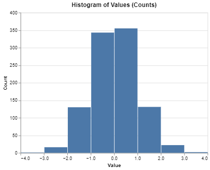 Histogram with Counts
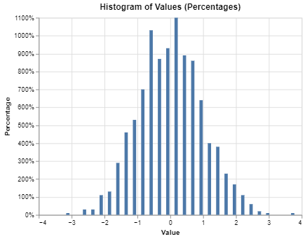
Step 4: Create a Histogram with Percentages
To display the histogram as percentages, we need to compute the relative frequency of data points in each bin. This can be done by normalizing the counts. In the code, following functions are used:
- transform_bin: This step creates bins for the value field, which is necessary for creating the histogram.
- transform_aggregate: Here, we count the number of data points in each bin.
- transform_calculate: We then calculate the percentage of the total for each bin.
- bin parameter in alt.X: You can control the bin size using the step parameter.
Python
# Histogram showing percentages
histogram_percentage = alt.Chart(data).transform_bin(
    'binned_value', field='value'
).transform_aggregate(
    count='count()', groupby=['binned_value']
).transform_calculate(
    percentage='datum.count / sum(datum.count)'
).mark_bar().encode(
    alt.X('binned_value:Q', bin=alt.Bin(step=0.5), title='Value'),
    alt.Y('percentage:Q', axis=alt.Axis(format='%'), title='Percentage')
).properties(
    title='Histogram of Values (Percentages)'
)

histogram_percentage
Step 5: Customizing the Histogram
You can further customize the appearance and behavior of your histogram by adjusting the bin size, color, and labels.
Python
# Customized histogram with percentages
histogram_custom = alt.Chart(data).transform_bin(
    'binned_value', field='value'
).transform_aggregate(
    count='count()', groupby=['binned_value']
).transform_calculate(
    percentage='datum.count / sum(datum.count)'
).mark_bar(color='teal').encode(
    alt.X('binned_value:Q', bin=alt.Bin(step=0.2), title='Value'),
    alt.Y('percentage:Q', axis=alt.Axis(format='%'), title='Percentage'),
    tooltip=['binned_value:Q', 'percentage:Q']
).properties(
    title='Customized Histogram of Values (Percentages)'
)

histogram_custom
Output:
 Customizing the Histogram
Conclusion
Creating a histogram of percentages instead of counts using Altair involves calculating the relative frequency of each bin. This approach provides a clearer understanding of the data distribution, especially when comparing different datasets or groups. Altair's powerful transformation and encoding capabilities make it an excellent choice for creating such visualizations.
By following the steps outlined in this article, you can effectively represent your data as percentages in histograms, enhancing the interpretability and impact of your visualizations.