Interactively Displaying and Hiding Lines in a Bokeh Plot
Last Updated :
23 Jul, 2025
Bokeh is a powerful Python library for creating interactive and visually appealing data visualizations. One of its standout features is the ability to interactively display and hide lines in a plot, which can be particularly useful when dealing with complex datasets. This article will guide you through the process of setting up interactive line visibility in Bokeh plots, ensuring that your visualizations are both informative and user-friendly.
Understanding Bokeh's Interactive Features
Bokeh is designed to create interactive plots that can be embedded in web applications.
- Unlike static plots, interactive plots allow users to engage with the data by zooming, panning, and toggling the visibility of plot elements.
- This interactivity is achieved through the integration of JavaScript and HTML, making Bokeh a versatile tool for modern data visualization needs.
Enabling Interactive Legends with Bokeh
Bokeh allows you to make legends interactive by setting the click_policy property of the legend. This property can be set to either "hide" or "mute" to control the behavior of the legend entries.
Step 1: Install and Import Bokeh
First, ensure that you have Bokeh installed. If not, you can install it using pip:
Python
Then, import the necessary modules:
Python
from bokeh.plotting import figure, show, output_notebook
from bokeh.layouts import column
from bokeh.models import CheckboxGroup
from bokeh.io import curdoc
import numpy as np

# Display plots inline in Jupyter Notebook
output_notebook()
Step 2: Create a Sample Plot with Multiple Lines
Let's start by creating a plot with multiple lines. We’ll include several lines to demonstrate how to toggle their visibility.
Python
# Sample data
x = np.linspace(0, 10, 100)
y1 = np.sin(x)
y2 = np.cos(x)
y3 = np.tan(x)

# Create a new plot
p = figure(width=600, height=400, title="Interactive Line Display")

# Add multiple lines
line1 = p.line(x, y1, color="blue", legend_label="sin(x)", line_width=2)
line2 = p.line(x, y2, color="green", legend_label="cos(x)", line_width=2)
line3 = p.line(x, y3, color="red", legend_label="tan(x)", line_width=2)

# Set initial visibility of lines
line1.visible = True
line2.visible = True
line3.visible = True

# Add legend
p.legend.title = "Functions"
Now, we’ll create checkboxes that allow users to toggle the visibility of each line.
Python
# Create CheckboxGroup for controlling line visibility
checkbox_group = CheckboxGroup(
    labels=["sin(x)", "cos(x)", "tan(x)"],
    active=[0, 1, 2]  # Initially all lines are visible
)
Step 4: Define Callback Function for Checkbox Interactions
We need to define a callback function that updates the visibility of the lines based on the selected checkboxes.
Python
def update_line_visibility(attr, old, new):
    # Get the list of active checkboxes
    active_labels = [checkbox_group.labels[i] for i in checkbox_group.active]

    # Update the visibility of each line based on the active checkboxes
    line1.visible = "sin(x)" in active_labels
    line2.visible = "cos(x)" in active_labels
    line3.visible = "tan(x)" in active_labels
Link the callback function to the on_change event of the checkbox group.
Python
# Add callback to checkbox group
checkbox_group.on_change("active", update_line_visibility)
Step 6: Arrange the Layout
Combine the plot and widgets into a layout and display it.
Python
# Arrange the layout
layout = column(checkbox_group, p)

# Add the layout to the current document
curdoc().add_root(layout)

# Show the plot (This will not display inline in Jupyter, use `show(layout)` if running outside)
show(layout)
Output:
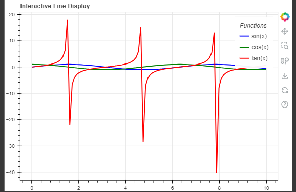 Interactively Display and Hide Lines in a Bokeh Plot
Conclusion
Interactive plots can greatly enhance the usability and effectiveness of data visualizations. Bokeh makes it easy to implement such features with minimal effort. By using interactive legends and JavaScript callbacks, you can provide users with the ability to explore data in a dynamic and engaging manner. Whether you're building dashboards or standalone visualizations, Bokeh's interactive capabilities can help you create more insightful and user-friendly data presentations.