Flutter - SliverAppBar Widget
Last Updated :
07 Apr, 2025
SliverAppBar is a Material Design widget in Flutter that gives a scrollable or collapsible app bar. The word Sliver is given to scrollable areas here. It allows us to create an app bar that can change appearance, blend in the background, or even disappear as we scroll. We already had AppBar widget in flutter, which places the app bar at a fixed height. But, looking around us, we can see that the scrollable app bar user interface is widely used. We can see that even the GeeksforGeeks app uses the app bar, which is collapsible. To achieve the same functionality, Flutter gives us the SliverAppBar widget, which is usually taken as a child widget to CustomScrollView (flutter widget), which provides it the power to interact with the scroll.

Constructor of SliverAppBar Class:
const SliverAppBar(
{
    Key key,
    Widget leading,
    bool automaticallyImplyLeading: true,
    Widget title,
    List<Widget> actions,
    Widget flexibleSpace,
    PreferredSizeWidget bottom,
    double elevation,
    Color shadowColor,
    bool forceElevated: false,
    Color backgroundColor,
    Brightness brightness,
    IconThemeData iconTheme,
    IconThemeData actionsIconTheme,
    TextTheme textTheme,
    bool primary: true,
    bool centerTitle,
    bool excludeHeaderSemantics: false,
    double titleSpacing: NavigationToolbar.kMiddleSpacing,
    double collapsedHeight,
    double expandedHeight,
    bool floating: false,
    bool pinned: false,
    bool snap: false,
    bool stretch: false,
    double stretchTriggerOffset: 100.0,
    Future<void> onStretchTrigger(),
    ShapeBorder shape,
    double toolbarHeight: kToolbarHeight,
    double leadingWidth}
)
Properties of SliverAppBar Widget:
Property | Description |
|---|
title | This property usually takes in the main widget as a parameter to be displayed in the SliverAppBar. |
expandedHeight | Similar to the collapsedHeight property, it also takes a double as a parameter and determines the height at which the SliverAppBar should be fully expanded. |
floating | This property takes in boolean as a Boolean parameter and controls the animation related to the visibility of the SliverAppBar. It determines whether the SliverAppBar should be made visible as soon as the user scrolls towards it (top or bottom) or not. |
pinned | This property sets whether the SliverAppBar should remain visible at the start of the scroll view. It takes a boolean as a parameter. |
flexibleSpace | This property takes in a widget as a parameter and stacks it behind the toolbar when it collapses. |
actions | This property takes in a list of widgets as a parameter to be displayed after the title if the SliverAppBar is a row. |
leading | This property sets the widget that should be displayed before the title. |
bottom | This property takes in PreferredSizeWidget as a parameter. And it determines the widget to be shown across the bottom of the SliverAppBar. It is usually a TabBar similar to the GeeksforGeeks app. |
backgroundColor | This property is used to add colors to the background of the SliverAppbar. |
foregroundColor | The default color for text and icons within the SliverAppBar. |
shadowColor | This property determines the color of the shadow that gets displayed below the SliverAppBar. |
elevation | This property is used to set the z-coordinate at which to place this app bar relative to its parent. |
Example:
main.dart:
Dart
import 'package:flutter/material.dart';

// Entry point of the application
void main() => runApp(MyApp());

// Main application widget
class MyApp extends StatelessWidget {
  @override
  Widget build(BuildContext context) {

    // Title for the app bar
    final title = 'GeeksforGeeks';

    return MaterialApp(
      home: Scaffold(
        body: CustomScrollView(
          slivers: <Widget>[
            // SliverAppBar provides a flexible app bar
            SliverAppBar(

              // App bar does not snap into view
              snap: false,

              // App bar is not pinned at the top
              pinned: false,

              // App bar does not float
              floating: false,
              flexibleSpace: FlexibleSpaceBar(

                // Center the title in the app bar
                centerTitle: true,
                title: Text(

                  // Title text
                  "$title",
                  style: TextStyle(

                    // White text color
                    color: Colors.white,

                    // Font size
                    fontSize: 16.0,
                  ),
                ),
                background: Image.network(

                  // Background image
                  "https://i.ibb.co/QpWGK5j/Geeksfor-Geeks.png",

                  // Cover the entire space
                  fit: BoxFit.cover,
                ),
              ),

              // Height of the expanded app bar
              expandedHeight: 230,

              // Background color
              backgroundColor: Colors.greenAccent[400],
              leading: IconButton(

                // Menu icon
                icon: Icon(Icons.menu),

                // Tooltip for the menu icon
                tooltip: 'Menu',

                // Action for the menu icon
                onPressed: () {},
              ),
              actions: <Widget>[
                IconButton(

                  // Comment icon
                  icon: Icon(Icons.comment),

                  // Tooltip for the comment icon
                  tooltip: 'Comment Icon',

                  // Action for the comment icon
                  onPressed: () {},
                ),
                IconButton(

                  // Settings icon
                  icon: Icon(Icons.settings),

                  // Tooltip for the settings icon
                  tooltip: 'Setting Icon',

                  // Action for the settings icon
                  onPressed: () {},
                ),
              ],
            ),

            // SliverList displays a scrollable list of items
            SliverList(
              delegate: SliverChildBuilderDelegate(
                (context, index) => ListTile(
                  tileColor: (index % 2 == 0)
                      ? Colors.white
                      : Colors.green[50], // Alternating tile colors
                  title: Center(
                    child: Text(

                      // Display the index as text
                      '$index',
                      style: TextStyle(

                        // Normal font weight
                        fontWeight: FontWeight.normal,

                        // Font size
                        fontSize: 50,

                        // Text color
                        color: Colors.greenAccent[400],
                      ),
                    ),
                  ),
                ),

                // Number of items in the list
                childCount: 51,
              ),
            ),
          ],
        ),
      ),

      // Remove debug banner
      debugShowCheckedModeBanner: false,
    );
  }
}
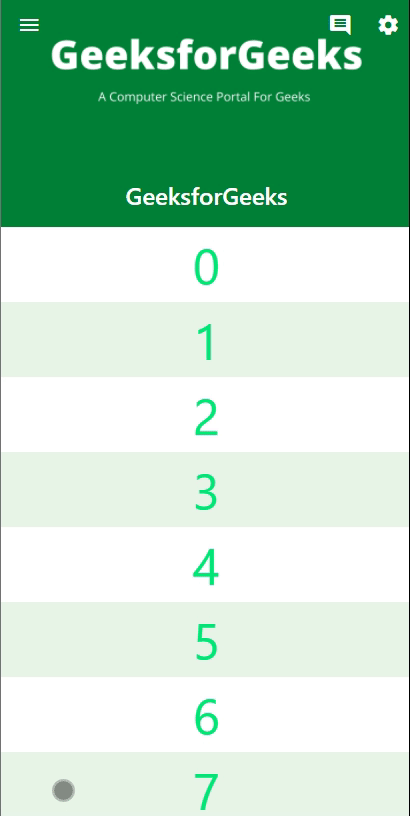
Output:
If the properties are defined as follows:
snap: false;
pinned: false;
floating: false;
Output:
If the properties are defined as follows:
snap: false;
pinned: false;
floating: true;

Output:
If the properties are defined as follows:
snap: false;
pinned: true;
floating: false;

Output:
If the properties are defined as follows:
snap: true;
pinned: false;
floating: true;

Output:
If the properties are defined as follows:
snap: true;
pinned: true;
floating: true;

Similar Reads
Flutter - Stepper Widget
In this article, we will learn about the Stepper widget in Flutter. A stepper widget displays progress through a sequence of steps. Stepper is generally used in filling forms online. For example, remember filling an online form for applying to any university or passport or driving license. We filled
8 min read
Flutter - SizedBox Widget
SizedBox is a built-in widget in flutter SDK. It is a simple box with a specified size. It can be used to set size constraints to the child widget, put an empty SizedBox between the two widgets to get some space in between, or something else. It is somewhat similar to a Container widget with fewer p
3 min read
Flutter - GridPaper Widget
A grid paper is a paper that has a grid on it with divisions and subdivisions, for example, graph paper. We may use grid paper in creating the graphs in our flutter application. A sample image is given below to get an idea about what we are going to do in this article. Â How to use it?Dart GridPaper(
3 min read
Flutter - ShaderMask Widget
ShaderMask is a widget in Flutter that applies a shader to its child. It allows you to create various visual effects by manipulating the colors and gradients of the child widget. In this article, we are going to implement the ShaderMask widget and explore some properties of it. Basic Syntax of Shade
3 min read
Flutter - StreamBuilder Widget
A StreamBuilder in Flutter is used to listen to a stream of data and rebuild its widget subtree whenever new data is emitted by the stream. It's commonly used for real-time updates, such as when working with streams of data from network requests, databases, or other asynchronous sources. In this art
5 min read
Flutter - Stack Widget
The Stack widget in Flutter is a powerful tool that allows for the layering of multiple widgets on top of each other. While layouts like Row and Column arrange widgets horizontally and vertically, respectively, Stack provides a solution when you need to overlay widgets. For instance, if you want to
6 min read
Flutter - ListTile Widget
The ListTile widget is used to populate a ListView in Flutter. It contains a title as well as leading or trailing icons. Let's understand this with the help of an example.The Constructor of the ListTile classListTile({ Key key, Widget leading, Widget title, Widget subtitle, Widget trailing, bool isT
4 min read
TextSpan Widget in Flutter
TextSpan is an immutable span of text. It has style property to give style to the text. It is also having children property to add more text to this widget and give style to the children. Let's understand this with the help of an example. Constructors:Syntax: TextSpan({String text, List<InlineSpa
3 min read
Flutter - Slide Transition Widget
In this article, we will explore the Flutter Slide Transition Widget. The Slide Transition widget allows animating a widget's position relative to its normal position. It helps us to develop a visually appealing and interactive user Interface. A sample video is given below to get an idea about what
4 min read
Flutter - Transform Widget
The Transform widget in Flutter is used to apply various transformations to its child widget, such as rotation, translation (positioning), scaling, and skewing. In this article, we are going to implement all transformations such as rotation, translation (positioning), scaling, and skewing made by th
6 min read