How to Create a Dynamic Pie Chart in Excel?
Last Updated :
22 Nov, 2021
In Excel, Pie-chart is a graphical representation of different sections or sectors of a circle based on the proportion, it holds from the complete quantity. Pie-charts are generally categorized into two types:
- Static Pie-chart: A pie-chart created with static or fixed input values is known to be a static pie-chart. The values of these types of pie-charts don’t change over time.
- Dynamic Pie-chart: A pie-chart created with dynamic or changing input values is known to be a dynamic pie-chart. The values of these type of pie-charts changes over time.
In this article, we will discuss how to create a dynamic excel pie chart? Creating a dynamic pie chart in Excel means creating a pie-chart that automatically(dynamically) gets updated when new values are entered into the table, which is used for creating the pie-chart. Creating a Dynamic Excel Pie Chart in Excel is very easy. We can create a dynamic pie chart using two different methods:
- Using offset formula
- Using Table
Creating a dynamic pie chart using offset formula
We can create a dynamic pie chart using the offset formula. So to this follow the following steps:
Step 1: Create a table and insert values in it. Apply the offset formula to get the value of the total column. Here 2000 value is present in the B4 cell. So, to get the first value of the total column, we will have to look for the value in the 0th row and 3rd column from the point of reference. The total column is calculated from the sum of Sale and Tax, so whenever there is any change in the values of the table, the Total column automatically gets updated.

Step 2: Total value of 550 appears in the cell.

Step 3: Now, drag the populated formula to get all the rows of the total column

Step 4: Select the values that need to be used for creating a dynamic pie-chart. Here, we are using the values calculated from the Offset formula. Click on Insert Menu and select the appropriate pie-chart.

Pie-chart gets inserted for the selected values.
Creating a dynamic pie chart using tables
We can also create a dynamic pie chart using tables. It is the easiest method for creating a dynamic pie chart. So to this follow the following steps:
Step 1: Create a table with proper headings and values inserted in it. Here, a table is created with Year-wise Sale, Tax, and Total(Sum of Sale and Tax) columns.

Step 2: Copy the headings and paste them separately. Here, Year, Sale, Tax, and Total are pasted separately.

Step 3: Select the column with the independent column(Year in the below table). Use Index Function and Counta function to bring the desired value for Year column.

Use of index function

Year 2005 is obtained as value for Year
Step 4: Use the Index and Count function for the dependent columns (Sale, Tax) to get their desired value for both the Sale and Tax column.

Table with selections

Use of Index function
Step 5: Select the columns Sale, Tax, Total. Choose option Pie-chart from Insert menu. A dynamic pie-chart of the table will be created.
Year 2005 values in the table are picked for the pie-chart
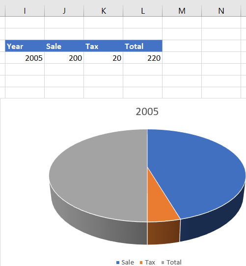
Pie-chart for Year 2005
Step 6: Insert a new row in the table. The pie-chart automatically gets updated, as per the new row being added in the table. Here, the pie-chart gets updated for the row with the Year 2006.

Year 2006 values added in the table are picked for the pie-chart

Pie-chart for Year 2006
Similar Reads
How to Create a Dynamic Chart Range in Excel?
A Dynamic chart range is the range of a data set which automatically updates on any modifications in the original data set. It is beneficial because at some point in time we need to add or delete data from the original data set. So, we want a method to automatically update the chart on performing an
5 min read
How to Create Dynamic Chart Titles In Excel?
Excel is a tool that is generally used by accounting professionals for financial data analysis but can be used for different purposes. It can be used for data visualization, data analysis, and data management, which uses spreadsheets for managing, storing, and visualizing large volumes of data. Cell
2 min read
How to Create a Line Chart in Excel
Line graphs are a highly valuable tool in Excel, helping users analyze trends and patterns effectively over time. They are widely used for time-series analysis in Excel, allowing a clear visual representation of changes in data. In this guide, you'll learn how to create a line graph in Excel, includ
10 min read
How to Create a Pareto Chart in Excel (Static And Dynamic)?
A Pareto Chart is a type of chart that contains both, a line chart and a bar chart where the cumulative total is represented by the line chart. They are generally used to find the defects to prioritize, in order to observe the greatest overall improvement. The chart is named for the Pareto principle
3 min read
How to Create a Step Chart in Excel
A step chart is used to represent data that changes irregularly between time intervals. Now, Excel doesn't have a feature to create a Step Chart like the one shown below but we can create one by making some changes in our data. What is a Step Chart in ExcelA Step chart is the same as a Line Chart. T
4 min read
How to Create a Rolling Chart in Excel?
A chart range is a data range that automatically updates as the data source is changed. This dynamic range is then utilized in a graphic as the source data. As the data changes, the dynamic range updates instantaneously, causing the chart to refresh. A common necessity when developing reports in Exc
3 min read
How to Create a Dynamic Chart with Drop down List in Excel?
The Dynamic Charts are the chart that gets updated itself when the range of underline data changes. In these types, of charts the dynamic range is used as the source data of the chart. So, as the data changes the dynamic range gets updated instantly which further updates the chart according to the n
4 min read
How to Create Pie of Pie Chart in Excel
A Pie Chart is one of the most popular data visualization tools used in Excel to display data in a circular form. However, when you have a lot of small values, they can be hard to differentiate in a standard pie chart. This is where the pie of pie chart with two data sets in Excel comes into play. I
7 min read
How to Create a Bar Chart in Excel?
To learn how to create a Column and Bar chart in Excel, let's use a simple example of marks secured by some students in Science and Maths that we want to show in a chart format. Note that a column chart is one that presents our data in vertical columns. A bar graph is extremely similar in terms of t
4 min read
How to Make a Dynamic Gantt Chart in Excel?
The Gantt chart is named after Henry Gantt, an American mechanical engineer and management consultant who devised it in the 1910s. In Excel, a Gantt diagram displays projects or tasks as cascading horizontal bar charts. A Gantt chart depicts the project's breakdown structure by displaying start and
4 min read