How to Create Shapes using CSS ?
Last Updated :
18 Sep, 2024
CSS shapes allow web developers to create a wide variety of geometric figures using simple CSS properties. These shapes can range from basic squares and circles to more intricate polygons like stars and hexagons.
This guide will walk you through how to create different shapes using CSS, providing practical examples and tips to help you achieve stunning designs on your websites.
Introduction to CSS Shapes
With CSS, you can create and style shapes effortlessly. These shapes can be used in website layouts, buttons, animations, and backgrounds. CSS provides powerful tools such as the border-radius property, clip-path, and transform to manipulate elements into desired shapes. By mastering these properties, you can improve user interaction and overall experience.
Let’s explore some of the basic and advanced shapes you can create using CSS.
Basic CSS Shapes: Examples and Code
1. Creating a square:
The square is one of the simplest shapes to create with CSS. Here’s an example of how to create a square:
html
<!DOCTYPE html>
<html>

<head>
    <style>
        .square {
            height: 50px;
            width: 50px;
            background-color: green;
        }
    </style>
</head>

<body>
    <div class="square"></div>
</body>

</html>
Output:

2. Creating Triangle:
Triangles can also be created with CSS. Here’s an example of how to create an upward triangle:
html
<!DOCTYPE html>
<html>

<head>
    <style>
        .triangle {
            width: 0;
            height: 0;
            border-left: 25px solid transparent;
            border-right: 25px solid transparent;
            border-bottom: 50px solid green;
        }
    </style>
</head>

<body>
    <div class="triangle"></div>
</body>

</html>
Output:

3. Creating a Rectangle:
A rectangle is simply a div with unequal height and width. Here's an example of how to create a rectangle
HTML
<!DOCTYPE html>
<html>

<head>
    <style>
        .rectangle {
            height: 100px;
            width: 200px;
            background-color: green;
        }
    </style>
</head>

<body>
    <div class="rectangle"></div>
</body>

</html>
Output:
 output
4. Creating a Circle:
A circle is essentially a square with border-radius: 50%;. Here's how you can create a circle
HTML
<!DOCTYPE html>
<html>

<head>
    <style>
        .circle {
            height: 100px;
            width: 100px;
            background-color: green;
            border-radius: 50%;
        }
    </style>
</head>

<body>
    <div class="circle"></div>
</body>

</html>
Output:
 Output
Advanced CSS Shapes: Examples and Code
Here are some important CSS shapes along with their CSS code, which you can simply copy and paste into your CSS section to create them.
5. Oval
CSS
.oval {
    width: 200px;
    height: 100px;
    background-color: green;
    border-radius: 50%;
}
Output:
 output
6. Diamond
CSS
.diamond {
    width: 100px;
    height: 100px;
    background-color: green;
    transform: rotate(45deg);
}
Output :
 output
7. Pentagon
CSS
.pentagon {
    position: absolute;
    top: 50%;
    left: 50%;
    transform: translate(-50%, -50%);
    height: 0;
    width: 180px;
    border-top: 180px solid green;
    border-left: 90px solid transparent;
    border-right: 90px solid transparent;
}

.pentagon:after {
    position: absolute;
    content: '';
    border-bottom: 180px solid green;
    border-left: 180px solid transparent;
    border-right: 180px solid transparent;
    bottom: 180px;
    left: -90px;
}
Output:
 output
8. Hexagon
CSS
.hexagon {
    width: 100px;
    height: 55px;
    background-color: green;
    position: relative;
}
.hexagon:before, .hexagon:after {
    content: "";
    position: absolute;
    width: 0;
    border-left: 50px solid transparent;
    border-right: 50px solid transparent;
}
.hexagon:before {
    bottom: 100%;
    border-bottom: 27.5px solid green;
}
.hexagon:after {
    top: 100%;
    border-top: 27.5px solid green;
}
Output:
 output
9. Trapezoid
CSS
.trapezoid {
    border-bottom: 100px solid green;
    border-left: 50px solid transparent;
    border-right: 50px solid transparent;
    height: 0;
    width: 150px;
}
Output :
 output
10. Parallelogram
CSS
.parallelogram {
    width: 200px;
    height: 100px;
    background-color: green;
    transform: skew(20deg);
}
Output :
 output
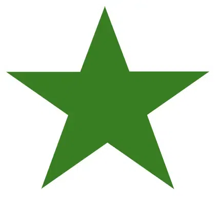
11. Star
CSS
 .star {
            --star-color: green;
            margin: 1em auto;
            font-size: 10em;
            position: relative;
            display: block;
            width: 0px;
            height: 0px;
            border-right: 1em solid transparent;
            border-bottom: 0.7em solid var(--star-color);
            border-left: 1em solid transparent;
            transform: rotate(35deg);
        }

        .star:before {
            border-bottom: 0.8em solid var(--star-color);
            border-left: 0.3em solid transparent;
            border-right: 0.3em solid transparent;
            position: absolute;
            height: 0;
            width: 0;
            top: -0.45em;
            left: -0.65em;
            display: block;
            content: "";
            transform: rotate(-35deg);
        }

        .star:after {
            position: absolute;
            display: block;
            top: 0.03em;
            left: -1.05em;
            width: 0;
            height: 0;
            border-right: 1em solid transparent;
            border-bottom: 0.7em solid var(--star-color);
            border-left: 1em solid transparent;
            transform: rotate(-70deg);
            content: "";
        }
Output :
 output
12. Heart
CSS
.heart {
            background-color: green;
            display: inline-block;
            height: 50px;
            margin: 0 10px;
            position: relative;
            top: 0;
            transform: rotate(-45deg);
            width: 50px;
        }

        .heart:before,
        .heart:after {
            content: "";
            background-color: green;
            border-radius: 50%;
            height: 50px;
            position: absolute;
            width: 50px;
        }

        .heart:before {
            top: -25px;
            left: 0;
        }

        .heart:after {
            left: 25px;
            top: 0;
        }
Output:
 output
13. Arrow
CSS
 .arrow {
            width: 150px;
            height: 30px;
            background-color: green;
            position: relative;
            display: inline-block;
        }

        .arrow:after {
            content: "";
            position: absolute;
            top: 0;
            right: -30px;
            width: 0;
            height: 0;
            border-left: 30px solid green;
            border-top: 15px solid transparent;
            border-bottom: 15px solid transparent;
        }
Output :
 Output
14. Crescent
CSS
.Crescent{
	position: absolute;
	top: 50%;
	left: 50%;
	transform: translate(-50%, -50%);
	height: 100px;
	width: 100px;
	box-shadow: -15px 15px 0 5px green ;
	border-radius: 50%;
}
Output :
 output