How to customize the axis of a Bar Plot in R
Last Updated :
18 Jul, 2021
Barplots in R programming language can be created using the barplot() method. It takes as input a matrix or vector of values. The bar heights are equivalent to the values contained in the vector.
Syntax: barplot(H, xlab, ylab, main, names.arg, col)
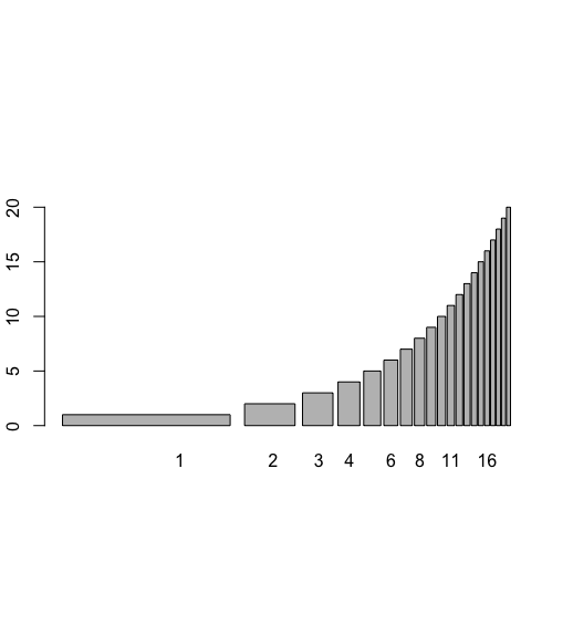
Labeling the X-axis of the bar plot
The names.args attribute in the barplot() method can be used to assign names to the x-axis labels. Numeric or character labels can be assigned which are plotted alternatively on the display window.
Example: Labeling the X-axis of the barplot
R
# creating a data frame
data_frame <- data.frame(col1 = 1:20,
                         col2 = 1:20,
                         col3 = 1)

# printing the data frame
print ("Original DataFrame")
print (data_frame)

# plotting a barplot
barplot(data_frame$col2, names.arg = data_frame$col1)
Output

Setting the Y-axis limit of the bar plot
The ylim parameter of the barplot() method can be used to set limits to portray on the display window. It contains a vector containing lower and higher limit.
Example: Setting the Y-axis limit of the bar plot
R
# creating a data frame
data_frame <- data.frame(col1 = 1:20,
                         col2 = 1:20,
                         col3 = 1)

# printing the data frame
print ("Original DataFrame")
print (data_frame)

# plotting a barplot
barplot(data_frame$col2, names.arg = data_frame$col1 , ylim= c(0,50) )
Output

Setting the X-axis limit of the bar plot
The xlim parameter of the barplot() method can be used to set limits to portray on the display window. It contains a vector containing lower and higher limit.
Example: Setting the X-axis limit
R
# creating a data frame
data_frame <- data.frame(col1 = 1:20,
                         col2 = 1:20,
                         col3 = 1)

# printing the data frame
print ("Original DataFrame")
print (data_frame)

# plotting a barplot
barplot(data_frame$col2, names.arg = data_frame$col1 , xlim= c(0,50) )
Output

Plotting logarithmic Y-axis
The log parameter can be set to display the axis and its corresponding values on the logarithmic scale. Setting the log value equivalent to character string y displays the modifications on the y axis.
Example: Plotting logarithmic Y-axis
R
# creating a data frame
data_frame <- data.frame(col1 = 1:20,
                         col2 = 1:20,
                         col3 = 1)

# printing the data frame
print ("Original DataFrame")
print (data_frame)

# plotting a barplot
barplot(data_frame$col2, names.arg = data_frame$col1 , log = "y" )
Output

Plotting logarithmic X-axis
The log parameter can be set to display the axis and its corresponding values on the logarithmic scale. Setting the log value equivalent to character string x displays the modifications on the x-axis.
Example: Plotting logarithmic X-axis
R
# creating a data frame
data_frame <- data.frame(col1 = 1:20,
                         col2 = 1:20,
                         col3 = 1)

# printing the data frame
print ("Original DataFrame")
print (data_frame)

# plotting a barplot
barplot(data_frame$col2, names.arg = data_frame$col1 , log = "x" )
Output
Renaming the group labels
The names.arg attribute can be renamed to assign a new set of labels to the x-axis arguments.
Example: Renaming the group labels
R
# creating a data frame
data_frame <- data.frame(col1 = 1:5,
                         col2 = 5:9,
                         col3 = 1)

# printing the data frame
print ("Original DataFrame")
print (data_frame)

# plotting a barplot
barplot(data_frame$col2, names.arg =c(
  "Grp1","Grp2","Grp3","Grp4","Grp5"))
Output

Adding label orientation
The orientation of the axis labels can be changed using the las attribute. The following specification symbols are used to specify the orientation :
0: always parallel to the axis
1: always horizontal
2: always perpendicular to the axis
3: always vertical.
Example: Adding label orientation
R
# creating a data frame
data_frame <- data.frame(col1 = 1:20,
                         col2 = 1:20,
                         col3 = 1)

# printing the data frame
print ("Original DataFrame")
print (data_frame)

# plotting a barplot
barplot(data_frame$col2, names.arg = data_frame$col1 , las=3)
Output

Adding axis labels
The xlab and ylab attributes contain character strings, which assign the respective names to the axes of the bar plots.
Example: Adding axis labels
R
# creating a data frame
data_frame <- data.frame(col1 = 1:20,
                         col2 = 1:20,
                         col3 = 1)

# printing the data frame
print ("Original DataFrame")
print (data_frame)

# plotting a barplot
barplot(data_frame$col2, names.arg = data_frame$col1 ,
        xlab = "Integers", ylab = "Numbers")
Output:

Similar Reads
How to Customize the Modebar in Plotly Using R? Plotly is a library for creating interactive graphs and visualizations. The modebar provides tools for zooming, downloading, and resetting the graph. Customizing the modebar can improve usability and make visualizations more suited to your needs. In this article, we'll explore how to customize the m
3 min read
How to change the color of a single bar in a bar plot When visualizing data with bar plots, highlighting specific bars can provide valuable insights or draw attention to key points. This article will guide you through the process of changing the color of a single bar in a bar plot using Python's popular data visualization library, Matplotlib. We’ll exp
3 min read
How to Auto Adjust Text in the Middle of a Bar Plot? Bar plots are widely used in data visualization to represent categorical data with rectangular bars. A critical aspect of enhancing the readability and informativeness of bar plots is the proper positioning of text labels. While adding text labels to bar plots is common, manually adjusting their pos
3 min read
How to change the order of bars in bar chart in R ? In this article, we will discuss how to change the order of bars in bar chart in R programming language. We can change the order of bars by using two plots ggplot and barplot. Method 1: Ggplot re-ordering Firstly create a sample dataset and plot the graph-Manual. Now let's reorder them accordingly.
4 min read
How to Change Axis Scales in R Plots? In this article, we will learn how to change Axis Scales in the R Programming Language. Method 1: Change Axis Scales in Base R To change the axis scales on a plot in base R Language, we can use the xlim() and ylim() functions. The xlim() and ylim() functions are convenience functions that set the li
4 min read
Remove Axis Values of Plot in Base R In this article, we will be looking at the approach to remove axis values of the plot using the base functions of the R programming language. In this approach to remove the axis values of the plot, the user just need to use the base function plot() of the R programming language, and further in this
2 min read