Introduction to CSS Flexbox
Last Updated :
28 Jun, 2025
CSS Flexbox, short for the Flexible Box Layout module, is a powerful layout tool designed to simplify web page layouts by arranging items in rows or columns with ease.
- Flexbox eliminates the need for floats or complex positioning, enabling responsive and dynamic layouts.
- It aligns items efficiently, distributing space within a container, even when their sizes are dynamic or unknown.
- Flexbox is supported in all modern browsers, making it a reliable choice for creating flexible designs.
What is CSS Flexbox?
The Flexible Box Layout module introduces a one-dimensional layout system that handles space distribution and item alignment effectively. It works seamlessly for horizontal (row) or vertical (column) arrangements, making it a go-to solution for responsive designs.
Key Features of CSS Flexbox
- Alignment: Easily aligns items along the main axis (row/column) or cross-axis (perpendicular direction).
- Space Distribution: Distributes space among items or gaps dynamically within a container.
- Responsive Design: Adapts to screen sizes without extra effort, perfect for modern web layouts.
HTML
<html>
<head>
    <style>
        .flex-container {
            display: flex;
            background-color: #f2f2f2;
            padding: 10px;
        }
        .flex-item {
            background-color: #4CAF50;
            color: white;
            margin: 5px;
            padding: 20px;
            text-align: center;
            flex: 1;
        }
    </style>
</head>
<body>
    <div class="flex-container">
        <div class="flex-item">Item 1</div>
        <div class="flex-item">Item 2</div>
        <div class="flex-item">Item 3</div>
    </div>
</body>
</html>
Output:
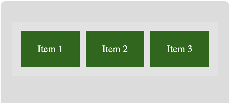
In this Example,
- The .flex-container class applies display: flex;, designating the div as a flex container.
- Each .flex-item is styled to have equal width within the container, with margins and padding for spacing.
Before the Flexbox Model
- Block: Sections in web pages
- Inline: Text
- Table: Two-dimensional table data
- Positioned: Explicit position of an element
Flexbox Components
- Flex Container: The parent div containing various divisions.
- Flex Items: The items inside the container div.

Flexbox Axes
Flexbox operates on two axes:
- Main Axis: Runs from left to right by default.
- Cross Axis: Perpendicular to the main axis, runs from top to bottom.
For Row:-
 Flexbox for Row Alignment
For Column:-
 Flexbox for Column Alignment
1. Main Axis:
- Main Start: The start of the main axis.
- Main Size: The length between Main Start and Main End.
- Main End: The endpoint of the main axis.
 Flexbox Main Axis
2. Cross Axis:
The cross axis will be perpendicular to the main axis.
- Cross Start: The start of the cross axis.
- Cross Size: The length between Cross Start and Cross End.
- Cross End: The endpoint of the cross axis.
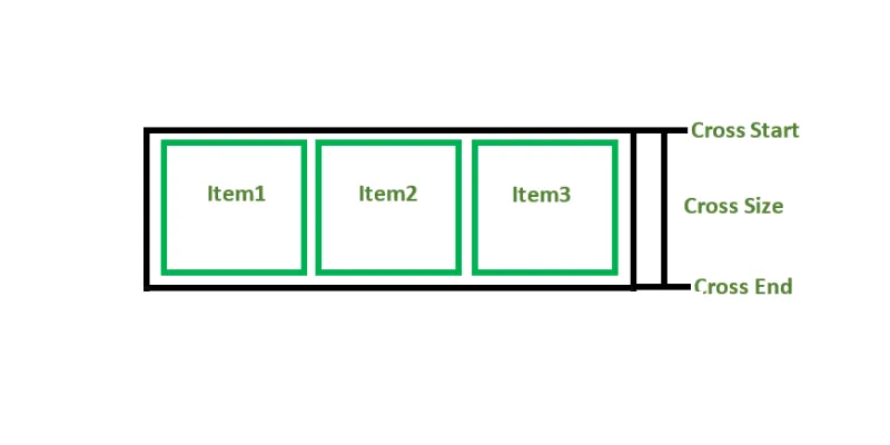 Flexbox Cross Axis
Flex Direction Properties
- Left to Right: flex-direction: row;
- Right to Left: flex-direction: row-reverse;
- Top to Bottom: flex-direction: column;
- Bottom to Top: flex-direction: column-reverse;
Aligning and Justifying Content
Flexbox provides several properties for aligning and justifying content within the container:
- justify-content: Aligns items along the main axis (e.g., flex-start, flex-end, center, space-between, space-around).
- align-items: Aligns items along the cross axis (e.g., stretch, center, flex-start, flex-end).
- align-content: Aligns rows within a flex container when there is extra space on the cross axis.
More Examples of CSS Flexbox
Responsive Design with Flexbox
Flexbox excels in creating responsive designs by adjusting items to fit various screen sizes. You can use media queries in combination with Flexbox properties to ensure your layout adapts seamlessly to different devices.
HTML
<html>
<head>
    <style>
    .flex-container {
        display: flex;
        flex-wrap: wrap;
        justify-content: space-around;
        background-color: #32a852;
    }
    .flex-container div {
        background-color: #c9d1cb;
        margin: 10px;
        padding: 20px;
        flex: 1 1 200px;
    }
    @media (max-width: 600px) {
        .flex-container {
            flex-direction: column;
        }
    }
    </style>
</head>
<body>
    <h2>Responsive Flexbox</h2>
    <div class="flex-container">
        <div>Item1</div>
        <div>Item2</div>
        <div>Item3</div>
    </div>
</body>
</html>
In this example,
- The .flex-container is a flexbox container with flex-wrap: wrap to allow items to wrap and justify-content: space-around for equal spacing between items.
- Media queries ensure a responsive layout by changing the flex-direction to column for screens smaller than 600px.
Horizontal Navigation Bar Using Flexbox
HTML
<html>
<head>
    <style>
        .navbar {
            display: flex;
            justify-content: space-between;
            align-items: center;
            background-color: #4CAF50;
            padding: 10px;
        }
        .navbar a {
            color: white;
            text-decoration: none;
            padding: 10px 15px;
        }
        .navbar a:hover {
            background-color: #45a049;
        }
    </style>
</head>
<body>
    <div class="navbar">
        <a href="#home">Home</a>
        <a href="#services">Services</a>
        <a href="#contact">Contact</a>
    </div>
</body>
</html>
Output:
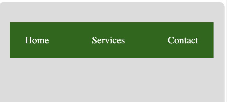
In this example,
- The .navbar uses display: flex with justify-content: space-between to spread navigation links evenly and align items horizontally.
- Hover effects are added to each or better interactivity, creating a simple yet effective navigation bar.