Class 8 RD Sharma Solutions - Chapter 24 Data Handling II (Graphical Representation of Data as Histograms) - Exercise 24.1 | Set 2
Last Updated :
23 Jul, 2025
Chapter 24 of RD Sharma's Class 8 mathematics textbook delves into Data Handling II, focusing specifically on the graphical representation of data through histograms. This chapter builds upon students' previous knowledge of data representation and introduces them to a more advanced method of visualizing grouped data.
Histograms are particularly useful for displaying continuous data sets, allowing students to quickly grasp the distribution and frequency of data points within specific intervals.
Through this chapter, students will learn how to construct, interpret, and analyze histograms, developing crucial skills in data analysis and statistical reasoning that are fundamental in various fields of study and real-world applications.
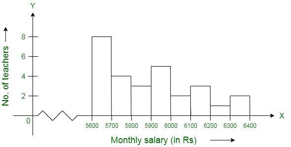
Question 7. Draw a histogram to represent the following data:
| Monthly Salary (in Rs) | No. of Teachers |
| 5600 – 5700 | 8 |
| 5700 – 5800 | 4 |
| 5800 – 5900 | 3 |
| 5900 – 6000 | 5 |
| 6000 – 6100 | 2 |
| 6100 – 6200 | 3 |
| 6200 – 6300 | 1 |
| 6300 – 6400 | 2 |
Solution:
To draw a histogram first construct x-axis and y-axis, where the x-axis represents monthly salary (in Rs) and y-axis represents the no. of teachers. Now, by taking suitable intervals from the given frequency table, we construct the rectangles as shown in the below figure.
Question 8. The following histogram shows the number of literate females in the age group of 10 to 40 years in a town:
(i) Write the age group in which the number of literate female is the highest.
(ii) What is the class width?
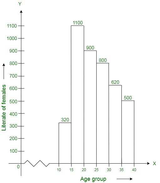
(iii) What is the lowest frequency?
(iv) What are the class marks of the classes?
(v) In which age group literate females are the least?
Solution:
(i) The highest rectangle corresponds to the highest number of literate females, which lies in the interval corresponding to 15−20 years.
(ii) According to the histogram the class intervals are 10−15, 15−20, 20−25, 30−35, 35−40. Therefore, the class width is 5.
(iii) The lowest frequency 320.
(iv) The class mark of the classes is the mid-point of the class interval.
i.e., Class mark = (upper limit + lower limit) / 2
Therefore, the class mark of each class is as given in the table:
| Class Interval | Class Marks |
| 10 – 15 | 12.5 |
| 15 – 20 | 17.5 |
| 20 – 25 | 22.5 |
| 25 – 30 | 27.5 |
| 30 – 35 | 32.5 |
| 35 – 40 | 37.5 |
(v) The lowest rectangle corresponds to the least number of literate females, which lies in the interval 10−15 years.
Question 9. The following histogram shows the monthly wages (in Rs) of workers in a factory:
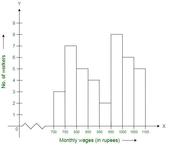
(i) In which wage-group the largest numbers of workers are being kept? What is their number?
(ii) What wages are the least number of workers getting? What is the number of such workers?
(iii) What is the total number of workers?
(iv) What is the factory size?
Solution:
(i) From the given figure, the highest rectangle corresponds to the largest number of workers. The required interval is, therefore, Rs 950−1000. There are 8 workers in this interval.
(ii) In the histogram the lowest rectangle corresponds to the least number of workers, so the required interval is Rs 900−950 and there are 2 workers in this interval.
(iii) The total number of workers is the sum of workers in all the intervals, which is:
Total workers = 3 + 7 + 5 + 4 + 2 + 8 + 6 + 5 = 40 workers
(iv) According to the histogram the factory intervals are 750−800, 800−850, ..., 1050−100. Hence, the required factory size is 50.
Question 10. Below is the histogram depicting marks obtained by 43 students of a class:
(i) Write the number of students getting the highest marks.
(ii) What is the class size?
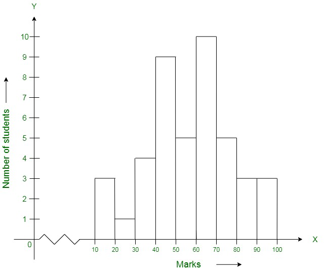
Solution:
(i) In the given histogram,
The interval with the highest marks is 90−100.
Three students are there in this interval because the height of the rectangle (90−100) is 3 units.
(ii) According to the histogram the class intervals are 10−20, 20−30, …, 90−100. Therefore, the class size is 10.
Question 11. The following histogram shows the frequency distribution of the ages of 22 teachers in a school:
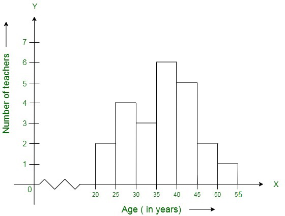
(i) What is the number of eldest and youngest teachers in the school?
(ii) Which age group teacher are more in the school and which least?
(iii) What is the size of the classes?
(iv) What are the class marks of the classes?
Solution:
(i) The number of the eldest teacher = 1 and the number of the youngest teacher = 2.
(ii) The teachers in age group 35-40 is most and the teachers in age group 50-55 is least.
(iii) Size of classes = 5.
(iv) The class marks of class 20-25 = \frac{20+25}{2} = 45/2 = 22.5.
The class marks of class 25-30 = 27.5
The class marks of class 30-35 = 32.5
The class marks of class 35-40 = 37.5
The class marks of class 40-45 = 42.5
The class marks of class 45-50 = 47.5
The class marks of class 50-55 = 52.5
Question 12. The weekly wages of 30 workers in a factory are given:
830, 835, 890, 810, 835, 836, 869, 845, 898, 890, 820, 860, 832, 833, 855, 845, 804, 808, 812, 840, 885, 835, 835, 836, 878, 840, 868, 890, 806, 840
Mark a frequency table with intervals as 800-810, 810-820, and so on, using tally marks. Also, draw a histogram and answer the following questions:
(i) Which group has the maximum number of workers?
(ii) How many workers earn Rs 850 and more?
(iii) How many workers earn less than Rs 850?
Solution:
The frequency table will be as given below:
Wages (in Rs) | No. of workers |
800-810 | 3 |
810-820 | 2 |
820-830 | 1 |
830-840 | 9 |
840-850 | 5 |
850-860 | 1 |
860-870 | 3 |
870-880 | 1 |
880-890 | 1 |
890-900 | 4 |
Total | 30 |
Now we draw a histogram, in which x-axis represent wages (in Rs) and y-axis represents the number of workers. Now, by taking suitable intervals from the given frequency table, we construct the rectangles as shown in the below figure.
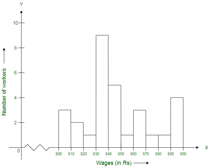
(i) Maximum number of workers are present in 830-840 wage group
(ii) Number of workers earn Rs 850 and more = 1 + 3 + 1 + 1 + 4 = 10
(iii) Number of workers earn less than Rs 850 = 3 + 2 + 1 + 9 + 5 = 20
Summary
Chapter 24 of RD Sharma's Class 8 mathematics textbook on Data Handling II provides students with a comprehensive understanding of histograms as a powerful tool for graphical representation of grouped data. Through a series of carefully crafted examples and exercises, students learn to construct histograms, interpret their visual information, and draw meaningful conclusions from the data presented. This chapter not only enhances students' mathematical skills but also develops their ability to analyze and communicate complex information visually. By mastering the concepts presented in this chapter, students lay a strong foundation for more advanced statistical analysis and data interpretation techniques they will encounter in higher studies and various professional fields.
Explore
Basic Arithmetic
Algebra
Geometry
Trigonometry & Vector Algebra
Calculus
Probability and Statistics
Practice