Power BI - Format Line and Stacked Column Chart
Last Updated :
05 Feb, 2023
A Line and Stacked Column chart is a combination of a line chart with a stacked column chart. We could add a secondary y-axis, with just 2 mouse clicks in Power BI. We have various options to format line and stacked column charts, we can change the value of the x-axis, y-axis, its title, etc. We can also add various options like series labels, markers, and data labels in this chart. In this article, we will learn how to format a Line and Stacked Column chart in Power BI and explore its various options.
Formatting a Line and Stacked Column Chart In Power BI
After the successful, creation of a line and stacked column chart in Power BI, we have multiple options to format it. For example, adding the title to the chart, changing the color, and position of the chart, and adding tooltips, bar colors, data labels, series labels, and total labels to the chart. We have been given a dataset, name, and Employee, and we have created the Line and Stacked Column chart, by adding the Employee name in the x-axis, bonus in the y-axis, and salary in the secondary y-axis. Using this chart, we will explore every option of this chart in Power BI. There are two types of Formatting in visualizations i.e. visual formatting and general formatting.

Visual Formatting
Visual formatting comprises 10 options i.e. Y-axis, X-axis, Secondary Y-axis, Legend, grid line, zoom slider, Lines, markers, columns, data labels, Series labels, and total labels.

X-Axis
The X-axis is the horizontal text of the chart.
The following are the steps:
Step 1: Click on the X-axis option. A drop-down appears. We have multiple options available here i.e. Values and Title. Click on the Values option, and a drop-down appears. For example, the values are Arushi, Gautam, etc. A font is an option used to select the type of text we want to show on the x-axis in the chart, we can also set the size of the text, etc.

Step 2: Similarly, click on the title option. For example, the title is Employee Name. To change the color of the title of the x-axis, click on the color option. Select the required color. For example, we have selected orange color, and the Employee Name is changed to orange color.

Y-Axis
The Y-axis is the vertical text of the chart. It is present on the left side of the line and stacked column chart.

The following are the steps:
Step 1: Click on the Y-axis option. A drop-down appears. We have multiple options available here i.e. Range, Values, and Titles. Click on the range option, and a drop-down appears. Minimum and Maximum values can be set by the range option. By default, the minimum value is 0 and the maximum value is the maximum value of the dataset. We can also make the same chart, in a log scale, and can also invert the range of the y-axis.

Step 2: Click on the Values option, and a drop-down appears. For example, the values are 0K, 5K, 20K, etc. A font is an option used to select the type of text we want to show on the y-axis in the chart, we can also set the size of the text, etc. The units can also be customized, to million, thousand, etc.

Step 3: Similarly, click on the title option. For example, the title is Sum of Bonus. To change the color of the title of the y-axis, click on the color option. Select the required color. For example, we have selected orange color, and the Sum of Bonus is changed to orange color.

Secondary Y-Axis
The secondary Y-axis is also the vertical text of the chart. It is present on the right side of the line and stacked column chart.

The following are the steps:
Step 1: Click on the secondary Y-axis option. A drop-down appears. We have multiple options available here i.e. Range, Values, and Titles. Click on the range option, and a drop-down appears. Minimum and Maximum values can be set by the range option. By default, the minimum value is 0 and the maximum value is the maximum value of the dataset. We can also make the same chart, in a log scale, and can also invert the range of the secondary y-axis.
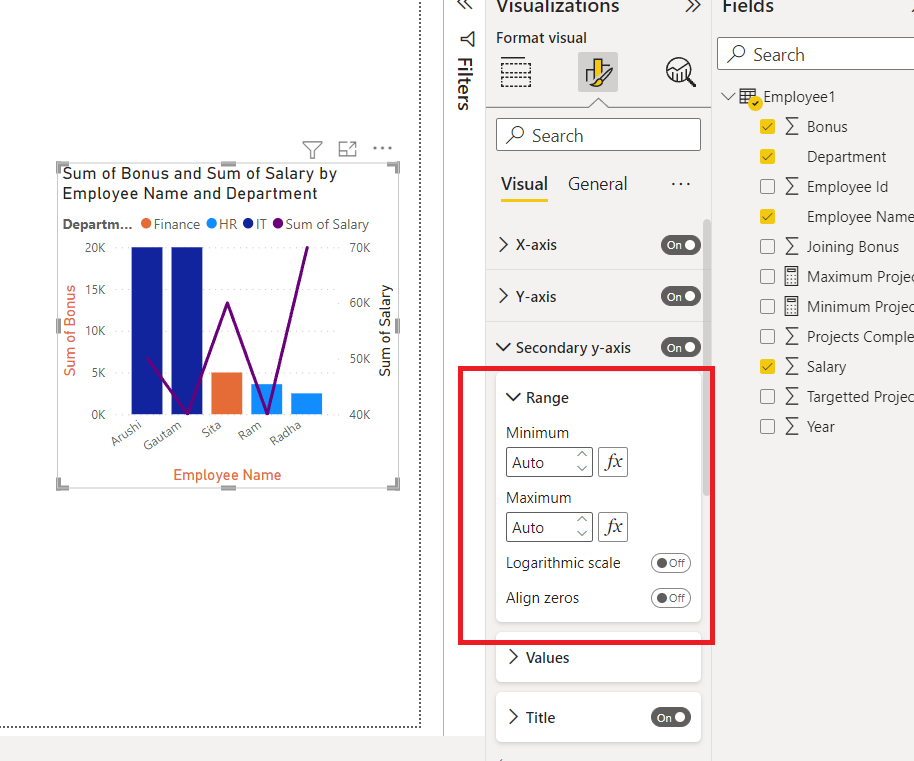
Step 2: Click on the Values option, and a drop-down appears. For example, the values are 40K, 50K, 70K, etc. A font is an option used to select the type of text we want to show on the secondary y-axis in the chart, we can also set the size of the text, etc. The units can also be customized, to million, thousand, etc.

Step 3: Similarly, click on the title option. For example, the title is Sum of Salary. To change the color of the title of the secondary y-axis, click on the color option. Select the required color. For example, we have selected orange color, and the Sum of Salary is changed to orange color.

Legends
Legends are the property that is used to sub-categorize the data for better analytics. It divides the data into different sub-groups.
The following are the steps:
Step 1: Click on the Legend option. A drop-down appears. We have multiple options available here i.e. Options, Text, and Title. We can set the position of the legends. Using the Text property, we can change the color and font size of the legends i.e. Department. Click on the Title, to customize the title i.e. Department.

Step 2: Click on the Options property, and a drop-down appears. We can set the position of the legends accordingly. For example, to Top Center, Bottom left, etc. By default, the Top left is the position.

Gridlines
Gridlines are the background lines, which are by default dotted in nature, and are very light and thin.
The following are the steps:
Step 1: Click on the Gridlines option. A drop-down appears. We have an option available i.e. Horizontal. Click on the Horizontal option, and a drop-down appears. By default, in the line and stacked column chart, only horizontal gridlines are available. We can edit the style of the line. Also, one can set the color and change the thickness of the gridlines.

Step 2: Under the Style option, click on the drop-down option. A list appears. We can change the style of the horizontal gridlines to solid, dashed, etc.

Step 3: If we close the slider of the horizontal gridlines, then the horizontal lines would disappear, as seen in the image below.

Zoom Slider
The zoom slider is used to increase or decrease the range of the numeric values on the y-axis.
The following are the steps:
Step 1: Click on the Zoom slider option. A drop-down appears. We have multiple options available here i.e. Y-axis, Slider labels, and slider tooltips. A slider will appear on the y-axis of the chart. Slider labels, enable the values on the slider as a mark strip. Slider tooltips are used whenever we are sliding the zoom slider, the numeric value will appear on it.

Step 2: The below gif shows how the bars change with the slider.

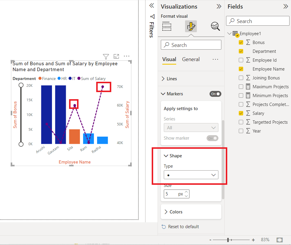
Lines
Lines refer to the curve of the Salary dataset values. Click on the Lines option. A drop-down appears. We have 4 options i.e. Apply Settings to, shape, colors, and spacing.

The following are the steps:
Step 1: Click on the Shape property. We can change the style of the line to dashed, solid, or dotted. Click on the colors property to customize the color of each of the lines of the legends. For example, change the color of the line to purple.

Markers
Markers refer to the endpoints of each line. Click on the markers option. A drop-down appears. We have 3 options i.e. Apply settings to, shape and colors.
The following are the steps:
Step 1: Click on the Shape button. A list appears for all different types of markers. Choose the marker as per your choice.

Columns
Columns refer to the bars of the line and stacked column chart. On the basis of different groups, we can set the color of the columns in this chart. For example, HR, IT, and Finance. These groups are classified on the basis of legends.

Data Labels
Data labels provide additional information on the lines and columns of the chart. For example, Arushi and Gautam have a salary of 50K and 40K, and they want to display that on the bar. Click on the Data labels option. The salary data label will be added to the entire chart. Also, a drop-down appears. We have four options i.e. apply settings to, options, values, and background. Values and background have the same property as discussed above i.e. font, size, and color. Apply settings to, is a filter on the basis of legends, we can apply the property to specific groups only. The options property is used to set the position of the data labels.

Series Labels
Series labels display the name of the column of the line. For example, the Sum of Salary is the series label in this chart. All the options present in series labels are the same as data labels.

Total Labels
Total labels are exactly the same as data labels. When we enabled the data labels option, we observed that the labels were shown inside the columns of the chart. Now, what if we want to show labels at the top of the chart? We can use, total labels to achieve it. Click on the total labels option. There are two properties of total labels i.e. Values, and Background. Values property is used to customize the font, size, and color of the total labels, and background property is used to change the color of the background of the total labels, in its certified area.

General Formatting
There are multiple options in general formatting. For a chart, we have options like Title, tooltip, effects, alt text, etc. We will look at each of the options in detail.

Property
The property option is generally present in every visualization. It contains three options, Size, position, and Advance options. We, generally do not use these properties, because all are easily accessible with mouse clicks. The size property helps to resize the visualization created. The position property changes the position of the visualization, in the report. The Advance option comprises adding a layer order, which is rarely used.

Title
The title formatting is present in every visualization. As the name suggests, it adds a heading to the visualization. Click on the slider to enable the title.
The following are the steps:
Step 1: Click on the Title option. A drop-down list appears. Add the title, under the Text section. For example, the Sum of Bonus and Sum of Salary by Employee Name and Department. We can view in the image a title is added to the chart. As done previously we can customize the size, font type of the chart, etc.

Step 2: We can also change the color of the title. Under the text color, select the required color. For example, yellow in this case. The title color changes to yellow.

Effects
The effects section comprises three features i.e. Background, Visual Border, and Shadow. All works according to their names. The background adds a background color to the visualization, the Visual border adds a border around the visualization, and the shadow option creates a shadow on the outskirts of the visualization.

The following are the steps:
Step 1: Click on the Background option. Select the color of the background accordingly. For example, Pink. We can view in the below image that the background of the chart changed to pink.

Header Icons
Header icons are the options, present on the top of the visualization. For this chart, there are three options, filter on visuals, More Focus, and more options. Click on the header-icons option, we will get various options, like Background, Border, and Icons. One can set its colors as per choice.

Tooltips
If we hover over a visualization, then we cannot view any information related to the chart. Consider a situation, where we want to display the fields added by hovering over the chart, then this task can be achieved by the Tooltips option. Tooltips have three properties i.e. Options, Text, and Background. Click on the tooltips option. Now, for example, we hover over the bar, then we can view that the employee Name Arushi, Department IT, Sum of Bonus 50K, and Total 20K. is displayed. We can set text and background color according to our needs.

Alt Text
Alt text is a property present in each visualization. People generally misinterpret, alt text by its name, they think that alt text will be displayed when they hover over the visualization. Alt text is for the persons, who cannot see the visuals, images, etc. This option is only available if you are using a narrator in your system. When your narrator is active, then this alt text will be spoken by the system. Click on the Alt text, and type the required text.

Similar Reads
Power BI Tutorial | Learn Power BI
Power BI is a Microsoft-powered business intelligence tool that helps transform raw data into interactive dashboards and actionable insights. It allow users to connect to various data sources, clean and shape data and visualize it using charts, graphs and reports all with minimal coding.It’s widely
5 min read
Introduction & Setup the Power BI
What is Business Intelligence?
Business Intelligence is the talk of a new changing and growing world that can be defined as a set of concepts and methodologies to improve decision-making in business through the use of facts and fact-based systems. The Goal of Business Intelligence is to improve decision-making in business ideas a
6 min read
Power BI - Introduction
Power BI is a tool from Microsoft that helps transform raw data into valuable insights. It allows you to create interactive reports and dashboards making it easier to understand complex data. Whether you’re a business analyst, data scientist or anyone working with data, Power BI helps simplify this
5 min read
Power BI - Key Components
Power BI is a data visualization and business intelligence tool created by Microsoft. It helps us to turn raw data into easy to understand reports and interactive dashboards which non-technical users can also create easily. In this article, we will understand its key components.Components of Power B
4 min read
Power BI - Practical Applications
A feature of Microsoft Office 365 called Power BI gives business users access to insights from their data. Users of the software can visualize information using a range of tools, such as graphs and diagrams. In other words, Power BI serves as a link between your data and the individual who will ulti
7 min read
How to Install Power BI on Windows?
Power BI: Power BI is an analytical software which is developed by Microsoft. BI means business intelligence. It is available only for Windows operating system. It was first released in 2011 and its stable release was in 2021. It is used for a variety of purposes like data visualization, data mining
2 min read
Power BI - Data Sources and its type
In this article, we will be looking at Data Sources and their type in Power BI. Power BI is an interactive data visualization software developed by Microsoft with a primary focus on business intelligence. It is part of the Microsoft Power Platform. The Power BI data sources that are available are as
2 min read
Differences Between Microsoft Power BI and SSRS
SSRS and Power BI are both Business Intelligence (BI) tools that are made to show data to users in a easy to understand way. Even though Microsoft made both but they are designed for different types of users and used for different purposes. In this article, we will see the differences between Power
3 min read
Power BI Free vs Power BI Pro vs Power BI Premium
Power BI is a tool developed by Microsoft to help users connect to various data sources and create interactive reports. It allows you to visualize your data in a way that makes it easier to see patterns and insights. Power BI was built using some of the features from Excel, like Power Query, Power P
4 min read
The Power BI Query Editor
Power BI - How to edit in Power BI App?
Power BI is a data visualization application that lets you connect, transform and find insights into the most pressing matters of your business. It helps in sourcing your data and creating visual dashboards, KPIs, and reports by editing the data as per your concerns. You can collaborate, share and i
8 min read
Power BI - DAX Date Functions
Knowing when and how to use DAX functions helps you build strong, high-performance data models and analysis large amounts of data in Power BI. In this article, we’ll explore important DAX Date Functions to help you manage dates in Power BITo begin load a dataset that contains date fields. Here we ar
3 min read
Power BI - How to Add Conditional Columns?
Creating insightful reports often requires data to be organized and categorized based on specific conditions. Conditional columns helps change or add values in a column based on logic you define. In this article, we’ll learn how to create conditional columns using Power Query Editor.Step 1: Open Pow
2 min read
DAX Aggregate Functions in Power BI
Microsoft Power BI is a tool that helps businesses to analyze data and create interactive reports and visualizations. It can connect to various data sources such as Excel, SQL databases, cloud services, etc and can perform aggregate functions on them for analysis. In this article we will learn about
6 min read
Power BI - Excel Integration
Power BI and Excel integration combine the data visualization and reporting capabilities of Power BI with the spreadsheet functionality of Excel. By linking the two users can analyze and manipulate Power BI data directly within Excel. This is vey useful tool for those who prefer working in Excel but
3 min read
PowerBI Dash Board Visualisation
Power BI - Dashboard Introduction
Power BI allows users to convert data into visuals and graphics to explore and analyze data, collaborate on interactive dashboards and reports. A Power BI dashboard is one page that shows different charts and visuals all designed to explore and interact with your data easily.How to Create a Simple D
5 min read
Power BI - Dashboard Actions
A single page, or palette, is what is referred to as a Power BI dashboard and it employs visualizations to convey a story. As it can only fit on one page, a well-designed dashboard delivers only the essentials of the scenario. Dashboards are a feature of the Power BI service. When utilizing Power BI
8 min read
Power BI - Create a Stacked Bar Chart
Sometimes there is a range of scenarios where it is hard to convey the information in a table and written format. Under such situations, Bar charts make things easier and more understandable. What are Stacked Charts & Bar Charts? Stacked charts are a sort of bar chart which are multiple-series i
3 min read
Power BI - How to add Reports to Dashboards?
Power BI Dashboards help you to view and summarize important information from your reports in one place. You can add an entire report or just specific parts like charts, cards or tables to a dashboard. You can also mix multiple reports into one dashboard. In this article, we’ll learn how to add full
3 min read
Power BI - Report Level Filters
Filters in Power BI sort data and knowledge based on some selected criteria. That is, you'll select particular fields or values within fields and view only the information related to them. as an example, you've got a dataset related to a store's sales. Now, using the filters you'll filter out unnece
2 min read
Power BI - How to Format Matrix?
Power Bi is an extensively used operation as it helps in storing, assaying, calculating, etc. data. Power Bi contains numerous functions that are used to maintain and show data in a presentable way. Matrix is one of the Power Bi is handy functions, it's a collection of figures that are arranged into
4 min read
Power BI - Slicer
Slicers are the interactive filters used to format and analyze the parts of the data more effectively. We can create a slicer easily with 4 steps, as shown in the later stage of the article. We have various options to format slicers, we can change the value of the alt text, title, etc. We can also a
6 min read
Power BI - How to Format a Card?
Cards in Power BI help us display a certain value, corresponding to different dynamic scenarios. For example, want to know the total population of the world, and the population of a certain country by a slicer, all can be achieved by cards in Power BI. In this article, we will learn how to format a
5 min read
Power BI - Format Multi-Row Card
Multi-Row cards in Power BI help us display multiple values, corresponding to different dynamic scenarios. For example, want to know the total population of the world, the average world's economy, annual total deaths all in a single card, to achieve such tasks we use multi-row cards. Under the field
6 min read
Power BI - How to Create a Map?
A map only locates the location as a data point, whether it's a continent, country, state, city, etc. Maps can also be plotted with the help of latitude and longitude. Maps can be useful, to know the current running business over different geographical locations. For example, if geeks for geeks want
3 min read
Power BI - How to Format Map
Maps are the visualizations that display dataset values on the basis of location. The location can be state, country, city, pin code, etc. We have various options to format maps. We can apply different styles to map, add legends, customize the colors of the bubbles, etc. In this article, we will lea
6 min read
Power BI - How to Create a Treemap?
TreeMap in Power BI is the hierarchical chart, which is used to show the parent and child data distribution. TreeMap is shown by a group of rectangles, these rectangles are segregated on the basis of the category. The larger numeric values are present at the top, and lower numeric values are present
3 min read
Power BI - How to Format Tree Map?
Tree Maps are the visualizations that display dataset values in the form of a hierarchical rectangle-cut format. We prefer Tree Map whenever we want to show large hierarchical data, in a limited space, with a better color combination, we have treemap as our first choice, also when we have a correlat
6 min read
Connect Power BI Desktop with Power BI Service
Power BI Desktop is the system version of Power BI present in the local system, It is downloaded as a free application. The comprehensive report authoring tool for report designers is Power BI Desktop. You can connect to many data sources through the desktop and then turn the data into a data model.
5 min read
Power BI - Create a Table
Tables are a way to represent data in the form of rows and columns. By default, the Power BI desktop creates a table itself, whenever data is dragged under the visualizations section. But, here will learn how to create the table manually, if not created by Power BI, we will also look at some aggrega
2 min read
Power BI - How to Format Table?
Sometimes we want to show data in tabular format for that we have two options here one is a table and another one is a matrix. This article deals with Tables in Power BI. You can use this dataset to follow along with this article. The topic that will be covered in the articles are: Creating a simple
4 min read
Power BI - Create a Stacked Column Chart
Sometimes there is a range of scenarios where it is hard to convey the information in the form of a table and written format. Under such situations, Column charts make things easier and more understandable. Let's understand what is stacked column chart is and how to create a stacked column chart. Wh
3 min read
Power BI - How to Format Stacked Column Chart?
Formatting is a technique to enhance the looks of the charts by giving a cosmetic appearance to the chart title and chart legend. Titles are given to the X and Y axis to add clarity for the user. Formatting commands are applied to a chart for the identical reason they're applied to a worksheet: they
5 min read
Power BI - Create 100% Stacked Column Chart
A 100% stacked column chart is formed by bar lines, which show the proportion of each data value in the form of percentages. This chart is generally, used when we want to match the ratios of different column values, with different fields. For example, if we want to compare the salary and bonus of ea
4 min read
Power BI - Create 100% Stacked Bar Chart
Power BI 100% stacked bar chart is used to display the relative percentage of multiple data series in stacked bars, where each stacked bar's total (cumulative) always equals 100%. In other words, A 100% stacked bar chart in power bi is a type designed to show the relative chance of multiple data ser
3 min read
Power BI - Format Stacked Bar Chart
Formatting is a technique to enhance the looks of the charts by giving a cosmetic appearance to the chart title and chart legend. Titles are given to the X and Y axis to add clarity for the user. Formatting commands are applied to a chart for the identical reason they're applied to a worksheet. they
4 min read
Power BI - How to Create a Stacked Area Chart
A stacked area chart is formed by combining the line chart, with the shaded area under that line. This chart is generally, used when we want to see the trends, that which field is performing better, in a particular time frame. For example, considering the stock prices of different companies, in the
3 min read
Power BI - Format Area Chart
An area chart is a combination of a line chart with an area covered below the line. We could add a secondary y-axis, with just 2 mouse clicks Power BI. We have various options to format area charts, we can change the value of the x-axis, y-axis, its title, etc. We can also add various options like s
11 min read
Power BI - Create a Radial Gauge Chart
A radial Gauge chart looks similar to a speedometer of a Car. A gauge chart is a half-circle chart, which tells whether a target is achieved or not. Gauge charts are generally used to measure the progress toward a goal. In this article, we will learn how to create a radial gauge chart in Power BI. C
4 min read
Power BI - Explain Key Performance Indicators (KPIs) dashboards
The KPIs evaluate an association’s performance in different areas by assessing quantifiable measure values. In businesses, KPIs play an essential part as visual cues that indicate growth by assessing values and measurable pretensions. A KPI always has a base value or measure which is estimated again
2 min read
Power BI _ Format KPIs Chart
Power BI _ Format Clustered Bar Chart
Power BI - How to Create a Waterfall Chart?
A waterfall chart shows a running value as quantities are added or subtracted. It’s helpful to visualize how an underlying value is influenced by a series of positive and negative changes. The columns are usually encoded using color so that you can quickly identify increments and decrements. In a wa
2 min read
Power BI - Format Waterfall Chart
A waterfall chart is generally used to check the trend in the data, with its ups and downs at particular intervals. We have various options to format waterfall charts, we can change the value of the x-axis, y-axis, its title, etc. We can also add various options like Breakdown, Gridlines, and data l
8 min read
Power BI - Create a Filled Map
A filled map is similar to a map in Power BI. A filled map, allocates a certain area of the location mentioned, while a map only locates the location as a data point, whether it's a continent, country, etc. Filled maps can be useful, to know the exact boundaries of a location, whether it is a countr
3 min read
Power BI - Format Filled Map
Filled Maps are the visualizations that display dataset values on the basis of location with the area allocated for that region. The difference between a map and a filled map is that a map only shows the data points for the selected location, but a filled map selects the area portion of that locatio
6 min read
Power BI - How to Create a Scatter Chart?
A Scatter chart is a chart, representing data points, spread on a graph, to show the column values. It helps us analyze and summarise the data very efficiently. We can also add legends, bubble sizes, and animations to this chart. This graph is widely used because it can show better visualizations in
4 min read
Power BI - Format Scatter Chart
Scatter charts are data distribution charts, in the form of data points. We have various options to format scatter charts, we can change the value of the x-axis, y-axis, its title, etc. We can also add various options like zoom slider, markers, and grid lines in the scatter chart. In this article, w
8 min read
Showing Trends with Line Charts
Power BI - Format Line Chart
A Line chart shows data in the form of a line. It is generally used when we have to show, continuous data graphically. We could add a secondary y-axis, with just 2 mouse clicks in Power BI. We have various options to format line charts, we can change the value of the x-axis, y-axis, its title, etc.
10 min read
Power BI - How to Create a Shape Map?
A shape map is similar to a map in Power BI. A shape map, shows the comparison between different regions, using different color shades, on a given value. For example, suppose the number of corona cases is higher in Uttar Pradesh, with respect to Haryana. In that case, the Uttar Pradesh state will be
4 min read
Power BI - Format Donut Chart
A donut chart is a circular chart, which could present values of a dataset in the form of slices of a donut. The donut chart is exactly the same as a pie chart, the only difference is pie chart has a circle, but a donut chart has a hole in the circle. We have various options to format donut charts,
6 min read
Power BI - Format Pie Chart
A pie chart is a circular chart, which could present values of a dataset in the form of slices of a circle. Â We have various options to format pie charts, we can change the value of the legends, rotation, detail labels, etc. In this article, we will learn how to format a pie chart in Power BI and ex
6 min read
Power BI - Format Ribbon Chart
A ribbon chart is a type of column chart, with ribbons joining each other. If the legends property is not added to the ribbon chart, then the ribbon chart is the same as the column chart. If we add legends to our chart, then a string of ribbons will be joined for each legend's values, showing the ra
8 min read
Power BI - Create a R Script Visual
An R script is different from R visuals. It helps transform our data into statistical analysis and machine learning algorithms on our datasets. It creates beautiful charts, with statistical measures. To make R Script Visual, we need to have some prerequisites i.e. Installing R in the System, and Che
4 min read
Power BI - Format Line and Stacked Column Chart
A Line and Stacked Column chart is a combination of a line chart with a stacked column chart. We could add a secondary y-axis, with just 2 mouse clicks in Power BI. We have various options to format line and stacked column charts, we can change the value of the x-axis, y-axis, its title, etc. We can
11 min read
Power BI - Format Line and Clustered Column Chart
A Line and Clustered Column chart is a combination of a line chart with a clustered(segregated) column chart. We could add a secondary y-axis, with just 2 mouse clicks in Power BI. We have various options to format line and clustered column charts, we can change the value of the x-axis, y-axis, its
11 min read
DAX Introduction
Power BI - How to Create Calculated Columns?
Power BI Desktop there are two data modification options known as Calculated Table and Calculated Column. These two options can add a whole new table referring to existing tables and a column to any existing table using existing columns of the respective table. Calculated Columns and Calculated Tabl
3 min read
Power BI- Functions
DAX is a very powerful feature provided with Power BI from Microsoft. DAX stands for Data Analysis Expressions. As we can understand from the name DAX consists of the functions and expressions that are used to manipulate the data or the reports. These expressions help to perform analysis of the data
5 min read
Power BI- DAX Window Function
The filter and value functions in DAX are some of the most complex and powerful and differ greatly from Excel functions. The lookup functions work by using tables and relationships, like a database. The filtering functions let you manipulate data context to create dynamic calculations. The WINDOW fu
5 min read
Power BI - DAX Logical Functions
Data analysis expressions, or DAX, are formulas or expressions used in calculations and data analysis. These expressions contain a variety of different functions, operators, and constants that are all evaluated collectively as a single formula to yield the desired outcomes (value or values). DAX for
5 min read
Power BI - DAX Information Functions
Data Analysis Expressions, or DAX, are formulas or expressions that are used for calculations and data analysis. These expressions consist of a number of different functions, operators, and constants that are all evaluated together as a single formula to produce the desired results (value or values)
5 min read
Power BI - DAX TEXT Functions
DAX is a collection of operators, constants, and functions that can be used to compute and return one or more values in an expression or formula. To put it simply, DAX gives you the ability to create new data from data that already exist in your model. DAX Text Functions Tables and columns can be us
11 min read
Power BI- DAX Index Function
Data filtering is one of the most widely used data analysis techniques. Data filtering eliminates the clutter and makes important information visible to everyone, whether they are financial experts, data scientists, marketers, or salespeople. Filtered data often results in a subset of data that may
4 min read
Power BI - DAX Trigonometric Functions
Microsoft Power BI uses the scripting language Data Analysis Expressions (DAX) to create calculated columns, measurements, and custom tables. It offers a number of useful functions that help create formulas and expressions that can be applied to a number of data analysis issues. You can develop reli
5 min read
Power BI - DAX COUPDAY Financial Function
Data Analysis Expressions is referred to as DAX in Power BI. It is an expressive language for formulas that are also utilized in Power BI and other visualization tools. It is utilized to create many kinds of formulae. We have all been utilizing various Excel functions in MS Excel for a very long tim
5 min read
Power BI - DAX Depreciation Functions
Formulas that do financial computations, including net present value and rate of return, use financial functions in DAX. These features are comparable to those found in Microsoft Excel's financial features. Microsoft added about 50 additional DAX capabilities to Power BI in July 2020. Some users may
9 min read
Power BI - Distinct() function
Data Analysis Expressions (DAX) include many functions that return a table rather than a value. The table isn't displayed but is used to provide input to other functions. For example, you can retrieve a table and then count the distinct values in it or calculate dynamic sums across filtered tables o
2 min read
Power BI - DAX Math Functions
A robust set of cloud-based business analytics tools called Power BI makes it simple to combine data from many sources, analyze and visualize information, and share insights. The Mathematical functions in Excel are quite similar to those in Data Analysis Expressions (DAX). Many functions in the Data
11 min read
Power BI - DAX Counting Functions
Many functions in the Data Analysis Expressions (DAX) return a table rather than a value. The table is used as an input for other functions, but it is not displayed. For instance, get a table and count the number of distinct values it contains, or you could compute dynamic sums over filtered tables
3 min read
Power BI- DAX Bitwise Functions
To generate formulas and expressions in Excel data models for Power BI, Analysis Services, and Power Pivot, Data Analysis Expressions (DAX), a group of functions and operators, can be combined. Data Analysis Expression is a feature of the Power BI toolset that enables business analysts to maximize t
2 min read
Top 30 Power BI Interview Questions and Answers (For Fresher & Experienced)
Power BI is a powerful business analytics tool developed by Microsoft, renowned for its interactive visualizations and business intelligence capabilities. It's widely adopted across various industries, making it a valuable skill for professionals in data analysis and reporting. Top companies like Mi
15+ min read