A pie chart is a circular statistical graphic, which is divided into slices to illustrate numerical proportions. It depicts a special chart that uses "pie slices", where each sector shows the relative sizes of data. A circular chart cuts in the form of radius into segments describing relative frequencies or magnitude also known as a circle graph. R Programming Language uses the function pie() to create pie charts. It takes positive numbers as a vector input.
Syntax
pie(x, labels, radius, main, col, clockwise)
Parameters:
- x: A vector of numeric values for the pie chart.
- labels: Descriptions for the pie chart slices.
- radius: Defines the radius of the pie chart (value between -1 and +1).
- main: Title of the pie chart.
- clockwise: Logical value determining if slices are drawn clockwise or anticlockwise.
- col: Colors for the pie chart slices.
1. Creating a simple pie chart
To create a simple R pie chart we can use the above parameters. It can be described by giving simple labels.
Example:
R
geeks<- c(23, 56, 20, 63)
labels <- c("Mumbai", "Pune", "Chennai", "Bangalore")

pie(geeks, labels)
Output:
 R - Pie Charts
1.1 Pie chart including the title and colors
To create a color and title pie chart.
- Take all parameters which are required to make a R pie chart by giving a title to the chart and adding labels.
- We can add more features by adding more parameters with more colors to the points.
Example:
R
geeks<- c(23, 56, 20, 63)
labels <- c("Mumbai", "Pune", "Chennai", "Bangalore")

pie(geeks, labels, main = "City pie chart",
            col = rainbow(length(geeks)))
Output:
 R - Pie Charts
1.2 Slice Percentage & Chart Legend
To create chart legend and slice percentage, we can plot by doing the below methods. We can show the chart in the form of percentages as well as add legends.
Example:
R
geeks <- c(23, 56, 20, 63)
labels <- c("Mumbai", "Pune", "Chennai", "Bangalore")

piepercent<- round(100 * geeks / sum(geeks), 1)

pie(geeks, labels = piepercent,
    main = "City pie chart", col = rainbow(length(geeks)))
    legend("topright", c("Mumbai", "Pune", "Chennai", "Bangalore"),
                    cex = 0.5, fill = rainbow(length(geeks)))
Output:
 R - Pie Charts
2. Add pie chart color palettes
With the help of .pal function of the RColorBrewer package in R, we can add use different color palettes available.
R
install.packages("RColorBrewer")
library(RColorBrewer)

geeks <- c(23, 56, 20, 63)
labelss <- c("Mumbai", "Pune", "Chennai", "Bangalore")

labels<- brewer.pal(length(geeks), "Set2")

pie(geeks, labels = labelss)
Output:
 R - Pie Charts
2.1 Modify the line type of the borders of the plot:
We can make use of the lty argument to modify the line type of the borders
R
install.packages("RColorBrewer")
library(RColorBrewer)

geeks <- c(23, 56, 20, 63)
labelss <- c("Mumbai", "Pune", "Chennai", "Bangalore")

labels<- brewer.pal(length(geeks), "Set2")

pie(geeks, labels = labelss, col = color, lty = 2)
Output:
 R - Pie Charts
2.2 Add shading lines with the density argument.
We can use the density argument to set he shaded lines in our plot.
R
install.packages("RColorBrewer")
library(RColorBrewer)

geeks <- c(23, 56, 20, 63)
labelss <- c("Mumbai", "Pune", "Chennai", "Bangalore")

labels<- brewer.pal(length(geeks), "Set2")

pie(geeks, labels = labelss,col = color, density = 50, angle = 45)
Output:
 R - Pie Charts
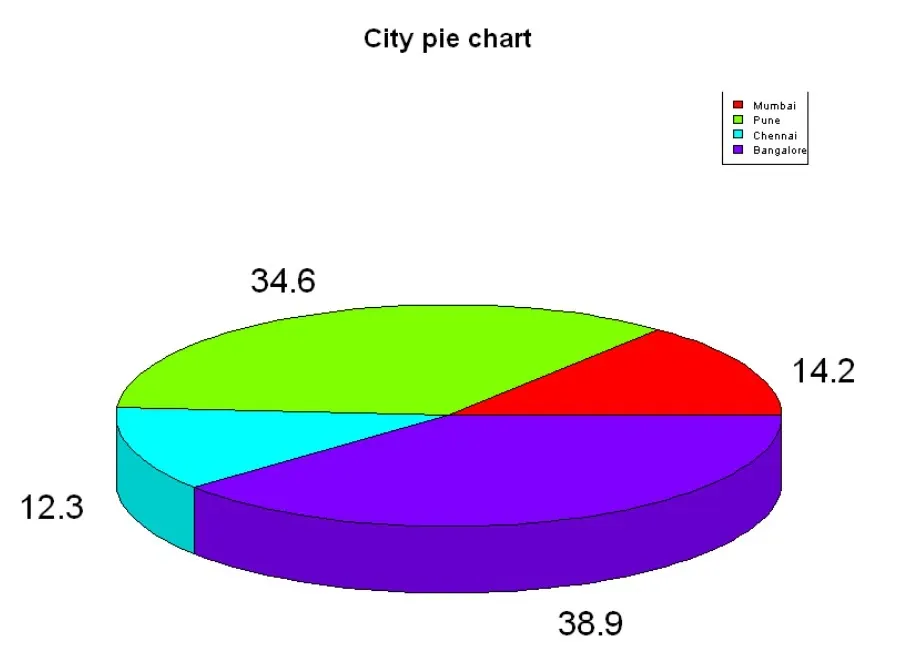
3. 3D Pie Chart
Here we are going to create a 3D Pie chart using plotrix package and then we will use pie3D() function to plot 3D plot.
R
install.packages("plotrix")
library(plotrix)

geeks <- c(23, 56, 20, 63)
labels <- c("Mumbai", "Pune", "Chennai", "Bangalore")

piepercent<- round(100 * geeks / sum(geeks), 1)

pie3D(geeks, labels = piepercent,
      main = "City pie chart", col = rainbow(length(geeks)))
      legend("topright", c("Mumbai", "Pune", "Chennai", "Bangalore"),
                    cex = 0.5, fill = rainbow(length(geeks)))
Output:
 R - Pie Charts