Tableau - Create Visualization
Last Updated :
08 Sep, 2025
Tableau is a data visualization tool that allows users to connect datasets and create visual representations. We will explore how we can create a series of visualizations in Tableau. Lets see how to do it:
1. Connecting to the Data
Open Tableau and connect to the databases.
The data source contains three files: Product, OrderDetails and PropertyInfo. These are separate Excel sheets within one file.
Note: You can also use tableau in built "Superstore" dataset which includes tables and fields such as Order ID, Product ID, Product Category, etc.

Open the Product data file first.
Add the OrderDetails data file which contains information about each order.
We can notice a join between the two data files. Hovering over the join shows that it is an inner join using the common key ProductID. An inner join combines data from two tables that share a common field.
Next, add the PropertyInfo file.
Hovering over the join shows that OrderDetails and PropertyInfo are also inner joined using PropertyID.
2. Creating a Basic Text Table
Now, that data is completely ready for data visualization. Click the Quantity field. In the top-right corner of Tableau, click the Show Me button.
Select the Text Table option.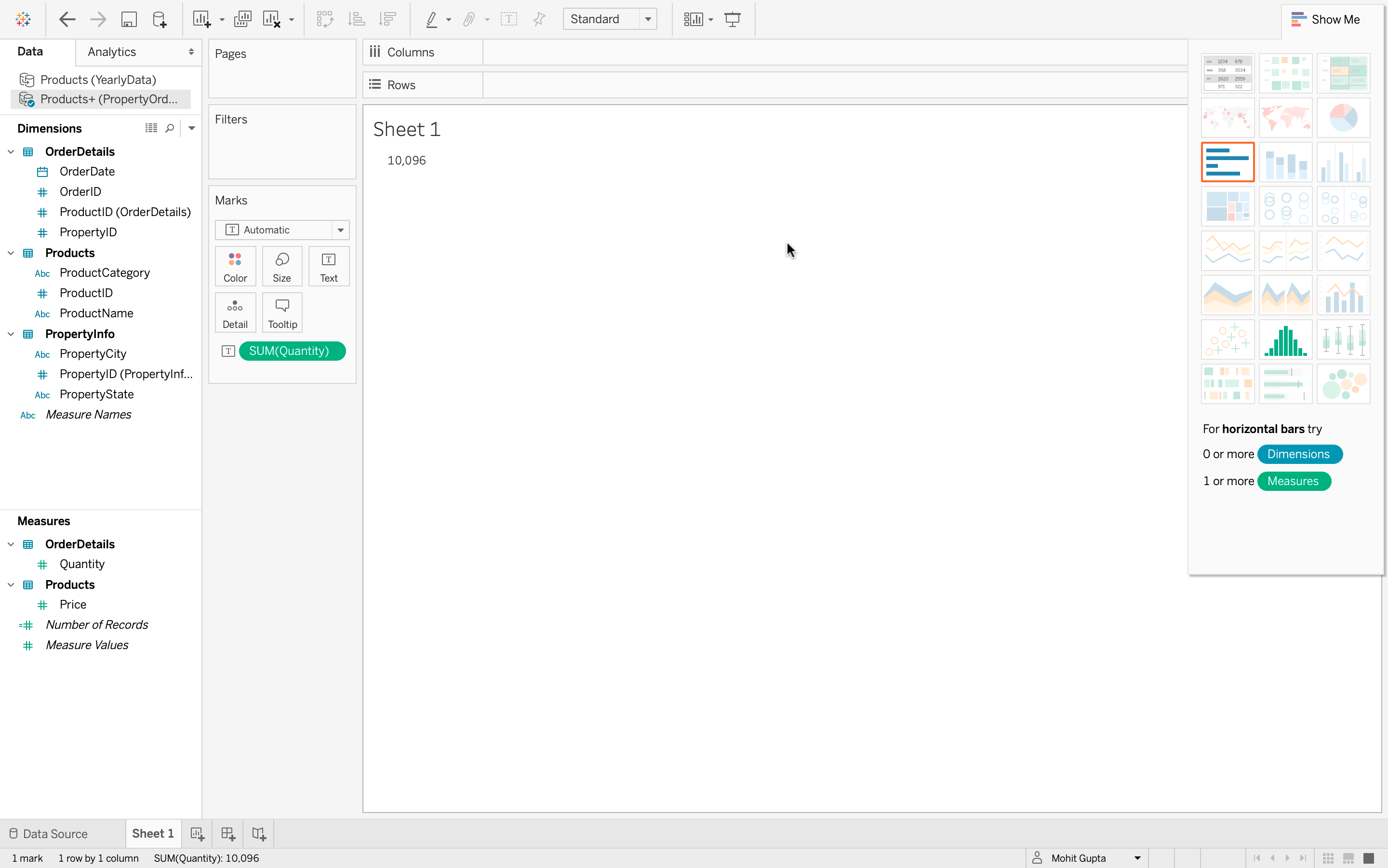
Since the data currently has only one measure (sum of quantity) and no subcategories, the total quantity of all items ordered is 10,096. While correct, this visualization is not very informative.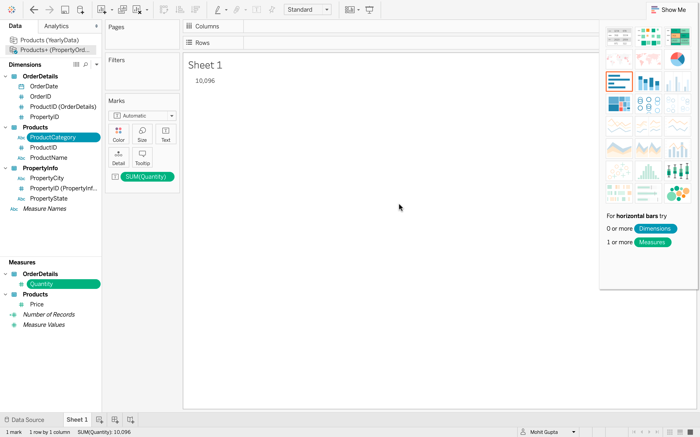
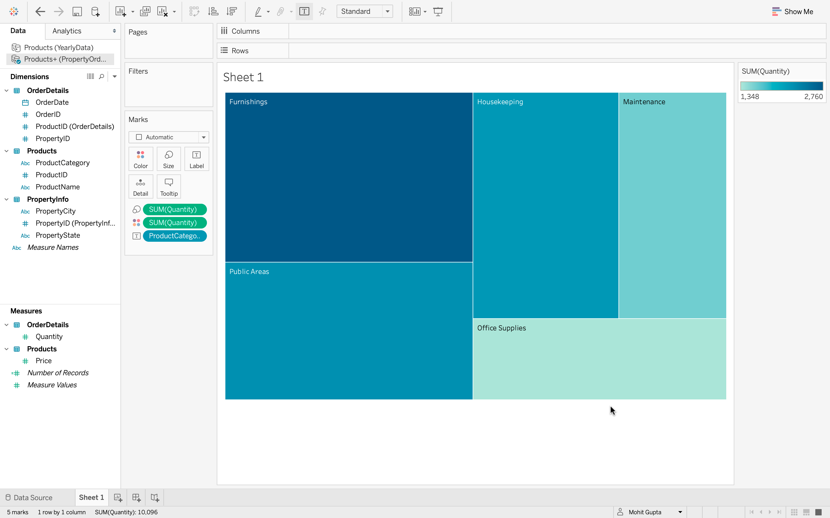
3. Creating a Tree Map for Better Insights
- Select multiple fields that are not next to each other. For example, Quantity and Product Category.
- Go to the Show Me tab to explore the wider variety of available visualizations.
- Click Tree Map which uses color and size to indicate the largest quantity values.

From the Tree Map We can conclude:
- Furnishings have the highest quantity of items ordered.
- Public Areas and Housekeeping are very close behind.
- Maintenance is fourth, slightly larger than Office Supplies, which is fifth.
Which Tableau feature allows you to quickly create visualizations using pre-defined chart suggestions?
Explanation:
The Show Me tab provides recommended visualizations based on the fields you select, helping you create charts quickly.
A line graph is most suitable for visualizing:
-
Categorical comparison at one point in time
-
Proportional distribution of data
-
Trends of values over time
-
Frequency distribution of numerical intervals
Explanation:
A line graph is best used to show how data values change or trend across a continuous time period.
What is another name for a vertical bar chart in Tableau?
Explanation:
In Tableau, a vertical bar chart is also called a column chart because it displays data using vertical bars (columns).
Which characteristic distinguishes a histogram from a bar chart?
-
Histograms display gaps between bars
-
Histograms represent categorical data
-
Histograms have no gaps between bars
-
Histograms show proportional slices
Explanation:
A histogram differs from a bar chart because its bars touch each other to represent continuous numerical intervals.
What does the size of each slice in a Tableau pie chart represent?
-
The frequency of the category
-
The proportional value of the data
-
The chronological order of data
-
The sum of all categories
Explanation:
Each slice in a pie chart is proportional to the numerical value it represents.
Which action allows you to change the layout of fields in a Tableau visualization?
-
-
Dragging fields between Rows and Columns shelves
-
Selecting a different chart type
-
Explanation:
In Tableau, you can change the visualization layout by dragging fields between the Rows and Columns shelves to adjust how data is displayed.
Which step allows you to change a field’s summary from SUM to AVERAGE in Tableau?
-
Edit Data Source and select Average
-
Use the Filter pane and select Average
-
Right-click the measure pill → Measure → Average
-
Drag the measure to Color marks and choose Average
Explanation:
Tableau allows changing aggregation by selecting Measure from the field menu and choosing a new summary function.
When creating a tree map, what does the size of each box typically indicate?
-
-
The relative value of a measure
-
The order of fields in Columns
-
The type of data source used
Which minimum field selection is required to create a histogram in Tableau?
-
One dimension and one measure
-
-
-
Quiz Completed Successfully
Your Score : 2/9
Accuracy : 0%
Login to View Explanation
1/9
1/9
< Previous
Next >
Explore
Introduction
Tableau Basics
Working with Data Sources
Visualization using Tableau
Tableau Calculations
Sort and Filter with Tableau
Different Charts in Tableau
Working with Dashboards
Advance Tableau Topics