Visualize correlation matrix using correlogram in R Programming
Last Updated :
05 Sep, 2020
A graph of the correlation matrix is known as Correlogram. This is generally used to highlight the variables in a data set or data table that are correlated most. The correlation coefficients in the plot are colored based on the value. Based on the degree of association among the variables, we can reorder the correlation matrix accordingly.
Correlogram in R
In R, we shall use the "corrplot" package to implement a correlogram. Hence, to install the package from the R Console we should execute the following command:
install.packages("corrplot")
Once we have installed the package properly, we shall load the package in our R script using the library() function as follows:
library("corrplot")
We shall now see how to implement the correlogram in R programming. We shall see the detailed explanation of the implementation with an example in a step by step manner.
Example:
Step 1: [Data for Correlation Analysis]: The first job is to select a proper dataset to implement the concept. For our example, we will be using the "mtcars" data set which is an inbuilt data set of R. We will see some of the data in this data set.
R
# Correlogram in R
# including the required packages
library(corrplot)

head(mtcars)
Output:
head(mtcars)
                   mpg cyl disp  hp drat    wt  qsec vs am gear carb
Mazda RX4         21.0   6  160 110 3.90 2.620 16.46  0  1    4    4
Mazda RX4 Wag     21.0   6  160 110 3.90 2.875 17.02  0  1    4    4
Datsun 710        22.8   4  108  93 3.85 2.320 18.61  1  1    4    1
Hornet 4 Drive    21.4   6  258 110 3.08 3.215 19.44  1  0    3    1
Hornet Sportabout 18.7   8  360 175 3.15 3.440 17.02  0  0    3    2
Valiant           18.1   6  225 105 2.76 3.460 20.22  1  0    3    1
Step 2: [Computing Correlation Matrix]: We will now compute a correlation matrix for which we want to plot the correlogram. We shall use the cor() function for computing a correlation matrix.
R
# Correlogram in R
# required packages
library(corrplot)

head(mtcars)
#correlation matrix
M<-cor(mtcars)
head(round(M,2))
Output:
head(round(M,2))
       mpg   cyl  disp    hp  drat    wt  qsec    vs    am  gear  carb
mpg   1.00 -0.85 -0.85 -0.78  0.68 -0.87  0.42  0.66  0.60  0.48 -0.55
cyl  -0.85  1.00  0.90  0.83 -0.70  0.78 -0.59 -0.81 -0.52 -0.49  0.53
disp -0.85  0.90  1.00  0.79 -0.71  0.89 -0.43 -0.71 -0.59 -0.56  0.39
hp   -0.78  0.83  0.79  1.00 -0.45  0.66 -0.71 -0.72 -0.24 -0.13  0.75
drat  0.68 -0.70 -0.71 -0.45  1.00 -0.71  0.09  0.44  0.71  0.70 -0.09
wt   -0.87  0.78  0.89  0.66 -0.71  1.00 -0.17 -0.55 -0.69 -0.58  0.43
Step 3: [Visualizing using Method argument]: At first, we shall see how to visualize the correlogram in different shapes like circles, pie, ellipse, and so on. We shall use the corrplot() function and mention the shape in its method arguments.
R
# Correlogram in R
# required packages
library(corrplot)

head(mtcars)
#correlation matrix
M<-cor(mtcars)
head(round(M,2))

#visualizing correlogram
#as circle
corrplot(M, method="circle")
# as pie
corrplot(M, method="pie")
# as colour
corrplot(M, method="color")
# as number
corrplot(M, method="number")
Output:


Step 4: [Visualizing using type argument]: We shall see how to visualize the correlogram in different types like upper and lower triangular matrices. We shall use the corrplot() function and mention the type argument.
R
# Correlogram in R
# required package
library(corrplot)

head(mtcars)

# correlation matrix
M<-cor(mtcars)
head(round(M,2))

# types
# upper triangular matrix
corrplot(M, type="upper")

# lower triangular matrix
corrplot(M, type="lower")
Output:


Step 5: [Reordering the correlogram]: We shall see how to reorder the correlogram. We shall use the corrplot() function and mention the order argument. We are going to use the "hclust" ordering for hierarchical clustering.
R
# Correlogram in R
# required packages
library(corrplot)
head(mtcars)
# correlation matrix
M<-cor(mtcars)
head(round(M, 2))
# reordering
# correlogram with hclust reordering
corrplot(M, type = "upper", order = "hclust")
# Using different color spectrum
col<- colorRampPalette(c("red", "white", "blue"))(20)
corrplot(M, type="upper", order = "hclust", col = col)
# Change background color to lightblue
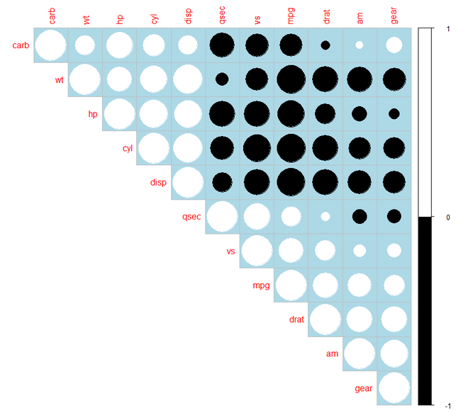
corrplot(M, type="upper", order="hclust",
col = c("black", "white"),
bg = "lightblue")
Output:


Step 6: [Changing the color in correlogram]: We shall now see how to change the color in correlogram. For this purpose, we have installed the "RColorBrewer" package and added it to our R script to use its palette colors.
R
# Correlogram in R
# required package
library(corrplot)
library(RColorBrewer)

head(mtcars)

# correlation matrix
M<-cor(mtcars)
head(round(M, 2))

# changing colour of the correlogram
corrplot(M, type="upper", order = "hclust",
         col=brewer.pal(n = 8, name = "RdBu"))
corrplot(M, type="upper", order = "hclust",
         col=brewer.pal(n = 8, name = "RdYlBu"))
corrplot(M, type="upper", order = "hclust",
         col=brewer.pal(n = 8, name = "PuOr"))
Output:


Step 7: [Changing the color and rotation of the text labels]: For this purpose, we shall include the tl.col and tl.str arguments in the corrplot() function.
R
# Correlogram in R
# required packages
library(corrplot)
library(RColorBrewer)

head(mtcars)

# correlation matrix
M<-cor(mtcars)
head(round(M, 2))

# changing the colour and
# rotation of the text labels
corrplot(M, type = "upper", order = "hclust",
         tl.col = "black", tl.srt = 45)
Output:

Step 8: [Computing the p-value of correlations]: Before we can add significance test to the correlogram we shall compute the p-value of the correlations using a custom R function as follows:
R
# Correlogram in R
# required package
library(corrplot)

head(mtcars)
M<-cor(mtcars)
head(round(M,2))

# mat : is a matrix of data
# ... : further arguments to pass
# to the native R cor.test function
cor.mtest <- function(mat, ...)
{
  mat <- as.matrix(mat)
  n <- ncol(mat)
  p.mat<- matrix(NA, n, n)
  diag(p.mat) <- 0
  for (i in 1:(n - 1))
  {
    for (j in (i + 1):n)
    {
      tmp <- cor.test(mat[, i], mat[, j], ...)
      p.mat[i, j] <- p.mat[j, i] <- tmp$p.value
    }
  }
  colnames(p.mat) <- rownames(p.mat) <- colnames(mat)
  p.mat
}

# matrix of the p-value of the correlation
p.mat <- cor.mtest(mtcars)
head(p.mat[, 1:5])
Output:
head(p.mat[, 1:5])
              mpg          cyl         disp           hp         drat
mpg  0.000000e+00 6.112687e-10 9.380327e-10 1.787835e-07 1.776240e-05
cyl  6.112687e-10 0.000000e+00 1.802838e-12 3.477861e-09 8.244636e-06
disp 9.380327e-10 1.802838e-12 0.000000e+00 7.142679e-08 5.282022e-06
hp   1.787835e-07 3.477861e-09 7.142679e-08 0.000000e+00 9.988772e-03
drat 1.776240e-05 8.244636e-06 5.282022e-06 9.988772e-03 0.000000e+00
wt   1.293959e-10 1.217567e-07 1.222320e-11 4.145827e-05 4.784260e-06
Step 9: [Add Significance Test]: We need to add the sig.level and insig argument in the corrplot() function. If the p-value is greater than 0.01 then it is an insignificant value for which the cells are either blank or crossed.
R
# Correlogram in R
# required package
library(corrplot)

head(mtcars)
M<-cor(mtcars)
head(round(M, 2))

library(corrplot)

# mat : is a matrix of data
# ... : further arguments to pass
# to the native R cor.test function
cor.mtest <- function(mat, ...)
{
  mat <- as.matrix(mat)
  n <- ncol(mat)
  p.mat<- matrix(NA, n, n)
  diag(p.mat) <- 0
  for (i in 1:(n - 1))
  {
    for (j in (i + 1):n)
    {
      tmp <- cor.test(mat[, i], mat[, j], ...)
      p.mat[i, j] <- p.mat[j, i] <- tmp$p.value
    }
  }
  colnames(p.mat) <- rownames(p.mat) <- colnames(mat)
  p.mat
}

# matrix of the p-value of the correlation
p.mat <- cor.mtest(mtcars)
head(p.mat[, 1:5])

# Specialized the insignificant value
# according to the significant level
corrplot(M, type = "upper", order = "hclust",
         p.mat = p.mat, sig.level = 0.01)

# Leave blank on no significant coefficient
corrplot(M, type = "upper", order = "hclust",
         p.mat = p.mat, sig.level = 0.01,
         insig = "blank")
Output:


Step 10: [Customizing the Correlogram]: We can customize our correlogram using the required arguments in corrplot() function and adjusting their values.
R
# Correlogram in R
# required package
library(corrplot)
library(RColorBrewer)

head(mtcars)
M<-cor(mtcars)
head(round(M,2))

# customize the correlogram
library(corrplot)
col <- colorRampPalette(c("#BB4444", "#EE9988",
                          "#FFFFFF", "#77AADD",
                          "#4477AA"))

corrplot(M, method = "color", col = col(200),
         type = "upper", order = "hclust",
         addCoef.col = "black", # Add coefficient of correlation
         tl.col="black", tl.srt = 45, # Text label color and rotation

         # Combine with significance
         p.mat = p.mat, sig.level = 0.01, insig = "blank",

         # hide correlation coefficient
         # on the principal diagonal
         diag = FALSE
)
Output:
