
 Data Structure
 Networking
 RDBMS
RDBMS Operating System
 Java
Java MS Excel
 iOS
iOS HTML
HTML CSS
CSS Android
 Python
 C Programming
 C++
C++ C#
C# MongoDB
 MySQL
MySQL Javascript
 PHP
PHP
- Selected Reading
- UPSC IAS Exams Notes
- Developer's Best Practices
- Questions and Answers
- Effective Resume Writing
- HR Interview Questions
- Computer Glossary
- Who is Who
Explain ReactNative SwitchSelector Component
SwitchSelector component is similar to a radio toggle button. It allows you to select with more than 2 values.
To work with SwitchSelector you have to install the package as shown below −
npm i react-native-switch-selector --save-dev
The basic SwitchSelector looks as follows −
<SwitchSelector
   106
   React Native – Q&A
   options={youroptions}
   initial={0}
   onPress={value => console.log(`value selected is : ${value}`)}
/>
Here are some important properties of SwitchSelector −
| Props | Description |
|---|---|
| options | An array with label, value and imageicon id
required. |
| initial | The initial item from the array that will be
selected. |
| value | The switch value that will be available with
onPress event |
| onPress | The event with callback function that will
get called when the Switch is changed. |
| fontSize | The fontSize to be considered for the label. |
| selectedColor | The color of the selected item. |
| buttonColor | Background color for the selected item. |
| textColor | The Label color for the items not selected. |
| backgroundColor | The backgroundColor for the switch selector component. |
| borderColor | Border color to be given for the component. |
Example: Working of SwitchSelector
To work with SwitchSelector we have to import the component as follows −
import SwitchSelector from "react-native-switch-selector";
Inside the SwitchSelector we won’t to display two options: Female/Male.
In the example, we are making use of female and male images and the same is used in the options array.
let male = require('C:/myfirstapp/myfirstapp/assets/male.png');
let female = require('C:/myfirstapp/myfirstapp/assets/female.png');
const images = {
   "female": female,
   "male": male,
};
const options =[
   { label: "Female", value: "f", imageIcon: images.female },
   { label: "Male", value: "m", imageIcon: images.male }
];
The SwitchSelector looks as follows −
<SwitchSelector
   initial={0}
   onPress={value => this.setState({ gender: value })}
   textColor='#ccceeaa'
   selectedColor='#7a44cf'
   buttonColor='#ccc'
   borderColor='#ccc'
   hasPadding
   options={options}
/>
Here is the full code of SwitchSelector −
Example
import React, { Component } from 'react';
import { StyleSheet, SafeAreaView } from 'react-native';
import SwitchSelector from "react-native-switch-selector";
let male = require('C:/myfirstapp/myfirstapp/assets/male.png');
let female = require('C:/myfirstapp/myfirstapp/assets/female.png');
const images = {
   "female": female,
   "male": male,
};
const options =[
   { label: "Female", value: "f", imageIcon: images.female },
   { label: "Male", value: "m", imageIcon: images.male }
];
export default class MySwitchSelectorComponent extends Component {
   render() {
      return (
         <SafeAreaView style={styles.container}>
            <SwitchSelector
               initial={0}
                  onPress={value => this.setState({ gender: value })}
                  textColor='#ccceeaa'
                  selectedColor='#7a44cf'
                  buttonColor='#ccc'
                  borderColor='#ccc'
                  hasPadding
                  options={options}
            />
         </SafeAreaView>
      )
   }
}
const styles = StyleSheet.create({
   container: {
      flex: 1,
      alignItems: "center",
      justifyContent: "center"
   },
});
Output
The output is as follows −

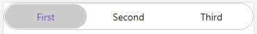
Example 2: SwitchSelector with three options
In the example below, we have used three options −
const options =[
   { label: "First", value: "a"},
   { label: "Second", value: "b" } ,
   { label: "Third", value: "c" }
];
The full code to display three options is as follows −
Example
import React, { Component } from 'react';
import { StyleSheet, SafeAreaView } from 'react-native';
import SwitchSelector from "react-native-switch-selector";
const options =[
   { label: "First", value: "a"},
   { label: "Second", value: "b" } ,
   { label: "Third", value: "c" }
];
export default class MySwitchSelectorComponent extends Component {
   render() {
      return (
         <SafeAreaView style={styles.container}>
            <SwitchSelector
               initial={0}
               onPress={value => this.setState({ gender: value })}
               textColor='#ccceeaa'
               selectedColor='#7a44cf'
               buttonColor='#ccc'
               borderColor='#ccc'
               fontSize='30'
               hasPadding
               options={options}
            />
         </SafeAreaView>
      )
   }
}
const styles = StyleSheet.create({
   container: {
      flex: 1
   }
});
Output

Updated on: 2021-07-01T08:52:48+05:30
406 Views

Advertisements