
 Data Structure
 Networking
 RDBMS
RDBMS Operating System
 Java
Java MS Excel
 iOS
iOS HTML
HTML CSS
CSS Android
 Python
 C Programming
 C++
C++ C#
C# MongoDB
 MySQL
MySQL Javascript
 PHP
PHP
- Selected Reading
- UPSC IAS Exams Notes
- Developer's Best Practices
- Questions and Answers
- Effective Resume Writing
- HR Interview Questions
- Computer Glossary
- Who is Who
How can data that has multiple variables be visualized using Seaborn in Python?
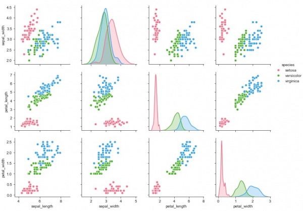
Seaborn is a library that helps in visualizing data. It comes with customized themes and a high level interface. In real-time situations, dataset contains many variables. Sometimes, it may be required to analyse the relationship of every variable with every other variable in the dataset. In such situations, bivariate distribution may take up too much time and may get complicated as well.
This is where multiple pairwise bivariate distribution comes into picture. The ‘pairplot’ function can be used to get the relationship between combinations of variables in a dataframe. The output would be a univariate plot.
Syntax of pairplot function
seaborn.pairplot(data,…)
Now let us understand how it can be plotted on a graph −
Example
import pandas as pd
import seaborn as sb
from matplotlib import pyplot as plt
my_df = sb.load_dataset('iris')
sb.set_style("ticks")
sb.pairplot(my_df,hue = 'species',diag_kind = "kde",kind = "scatter",palette = "husl")
plt.show()
Output

Explanation
- The required packages are imported.
- The input data is ‘iris_data’ which is loaded from the scikit learn library.
- This data is stored in a dataframe.
- The ‘load_dataset’ function is used to load the iris data.
- This data is visualized using the ‘pairplot’ function.
- Here, the dataframe is supplied as parameter.
- Here, the ‘kind’ parameter is specified as ‘kde’ so that the plot understands to print kernel density estimation.
- The type of plot is mentioned as a scatterplot.
- This data is displayed on the console.

Updated on: 2020-12-11T10:49:44+05:30
302 Views

Advertisements