
 Data Structure
 Networking
 RDBMS
RDBMS Operating System
 Java
Java MS Excel
 iOS
iOS HTML
HTML CSS
CSS Android
 Python
 C Programming
 C++
C++ C#
C# MongoDB
 MySQL
MySQL Javascript
 PHP
PHP
- Selected Reading
- UPSC IAS Exams Notes
- Developer's Best Practices
- Questions and Answers
- Effective Resume Writing
- HR Interview Questions
- Computer Glossary
- Who is Who
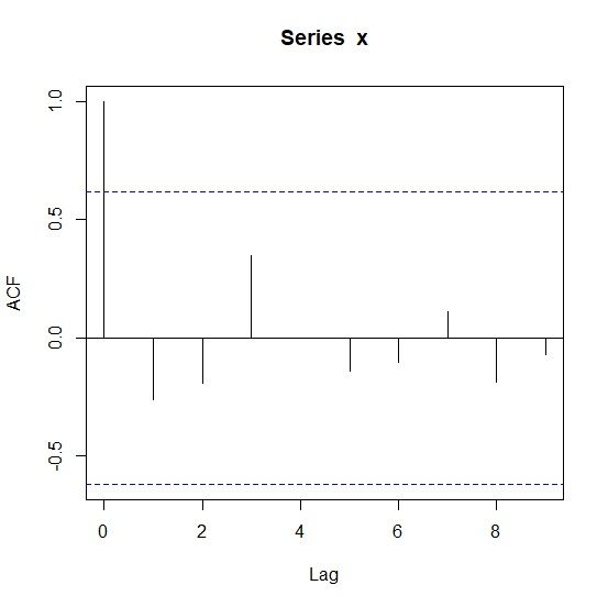
Create ACF Plot in R
The autocorrelation plot or ACF plot is a display of serial correlation in data that changes over time. The ACF plot can be easily created by using acf function.
For example, if we have a vector called V then we can create its autocorrelation plot by using the command given below −
acf(V)
Check out the below examples to understand how it can be done.
Example 1
To create ACF plot in R, use the code given below −
x<-sample(1:9,10,replace=TRUE)
x
If you execute the above given code, it generates the following output −
[1] 2 5 6 7 1 7 9 3 9 7
To create ACF plot in R, add the following code to the above snippet −
x<-sample(1:9,10,replace=TRUE)
acf(x)
Output
If you execute all the above given codes as a single program, it generates the following output −
Example 2
To create ACF plot in R, use the code given below −
y<-rpois(10,5)
y
If you execute the above given code, it generates the following output −
[1] 7 5 2 4 7 3 2 6 8 5
To create ACF plot in R, add the following code to the above snippet −
y<-rpois(10,5)
acf(y)
Output
If you execute all the above given codes as a single program, it generates the following output −


9K+ Views
