
 Data Structure
 Networking
 RDBMS
RDBMS Operating System
 Java
Java MS Excel
 iOS
iOS HTML
HTML CSS
CSS Android
 Python
 C Programming
 C++
C++ C#
C# MongoDB
 MySQL
MySQL Javascript
 PHP
PHP
- Selected Reading
- UPSC IAS Exams Notes
- Developer's Best Practices
- Questions and Answers
- Effective Resume Writing
- HR Interview Questions
- Computer Glossary
- Who is Who
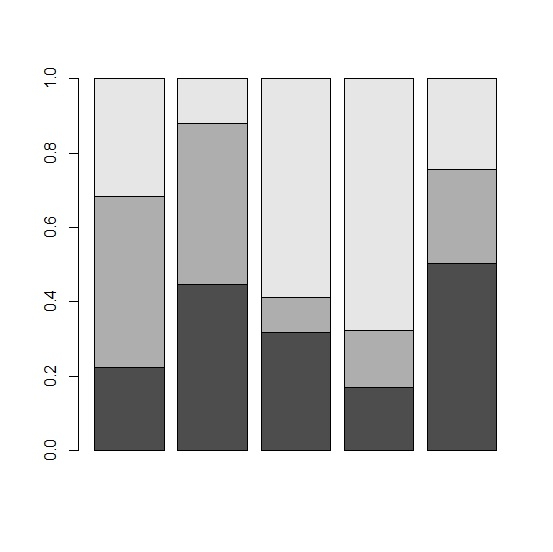
Create Stacked Bar Plot with Each Bar Summing to 1 or 100 in R
A stacked bar plot consists multiple bars in one bar, it shows one category for a categorical variable with its levels. Mostly, the stacked bar chart is created with the count of the levels in each category but if we want to create it with percentage for individual categories of the categorical variables then it can be done as well. We can use prop.table function to create the proportion of levels for each category then create the bar plot.
Example
Consider the below data frame −
> set.seed(99)
> x1<-sample(1:100,5)
> x2<-sample(1:100,5)
> x3<-sample(1:100,5)
> df<-data.frame(x1,x2,x3)
> df
x1 x2 x3
1 48 98 68
2 33 32 9
3 44 13 82
4 22 20 88
5 62 31 30
Creating a simple stacked bar plot −
> data<-rbind(x1,x2,x3)
> prop.table(data)
[,1] [,2] [,3] [,4] [,5]
x1 0.07058824 0.04852941 0.06470588 0.03235294 0.09117647
x2 0.14411765 0.04705882 0.01911765 0.02941176 0.04558824
x3 0.10000000 0.01323529 0.12058824 0.12941176 0.04411765
> barplot(data)
Output

Creating a bar plot where each bar sum to 1 −
> barplot(prop.table(data,2))
Output

Updated on: 2020-08-12T12:14:30+05:30
370 Views

Advertisements